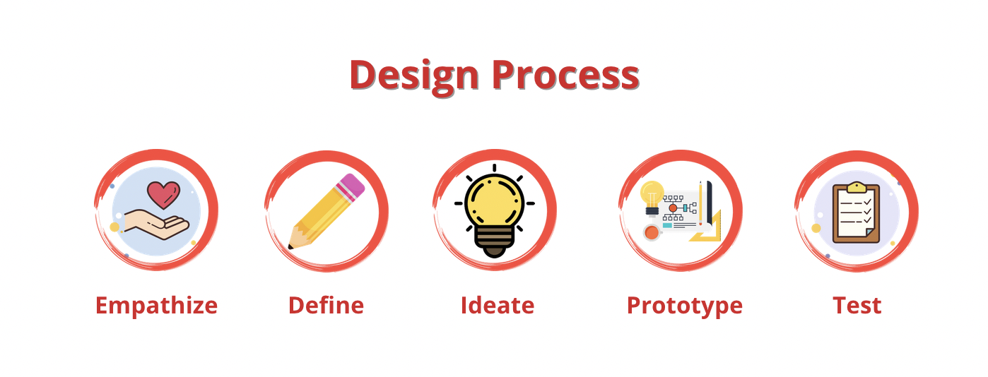
Netflix Feature
“Share It”
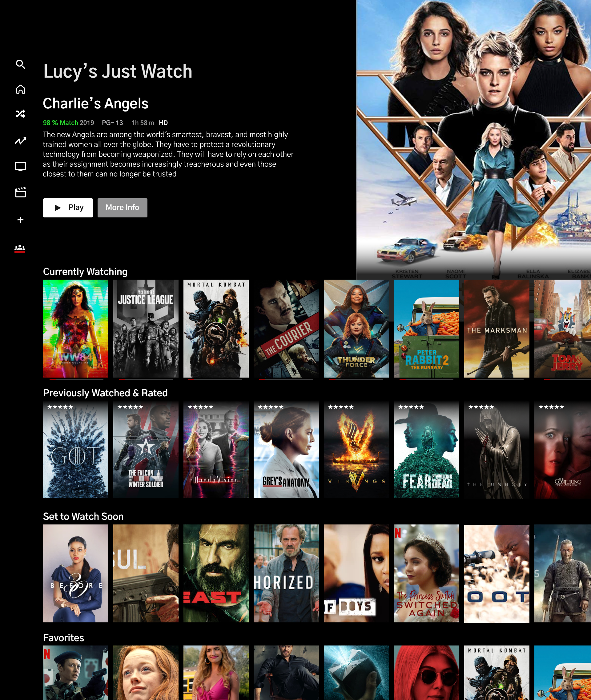
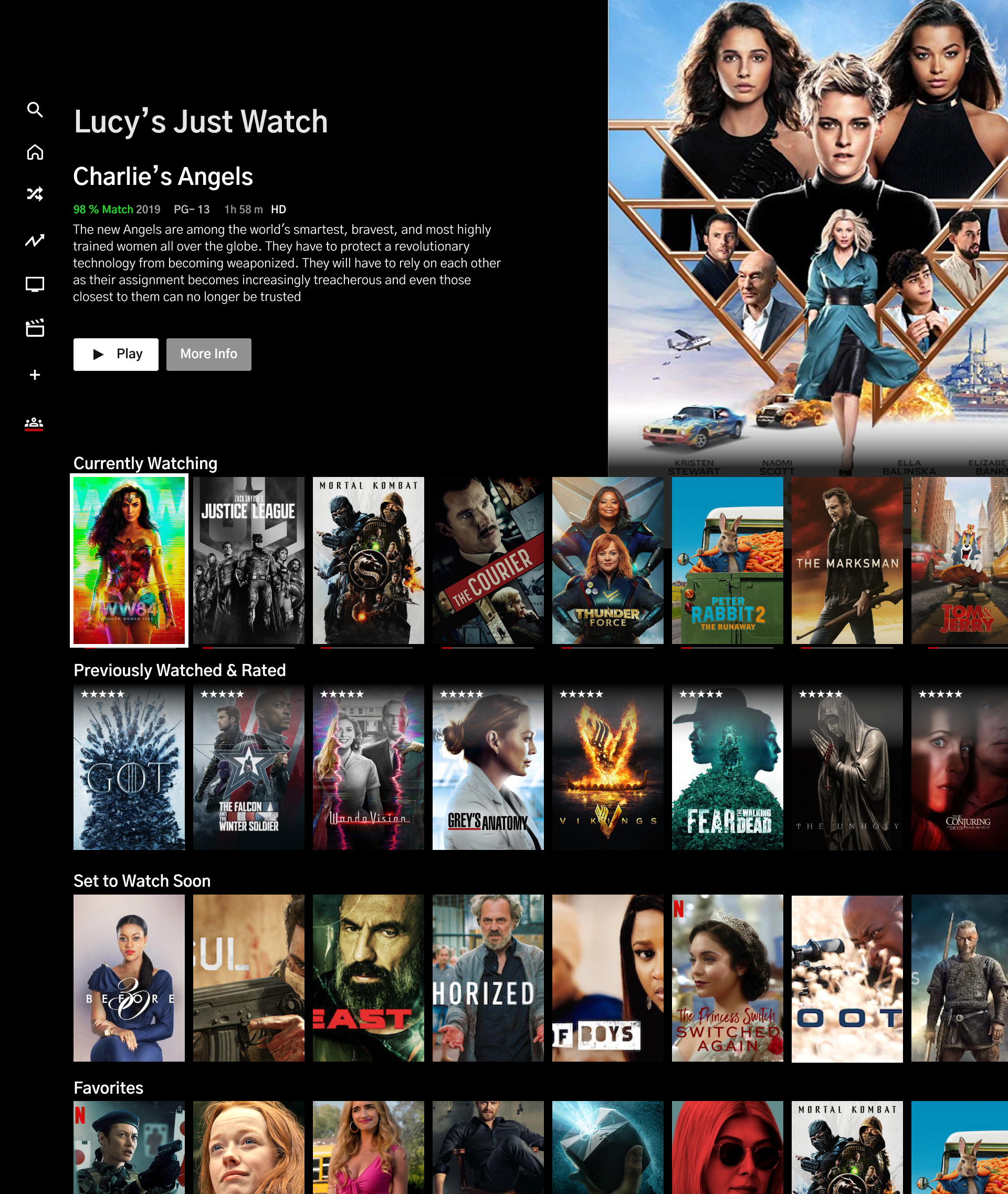
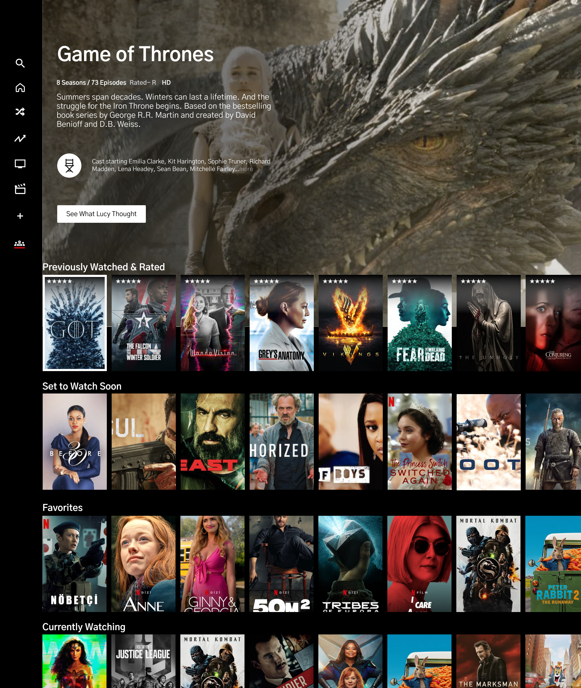
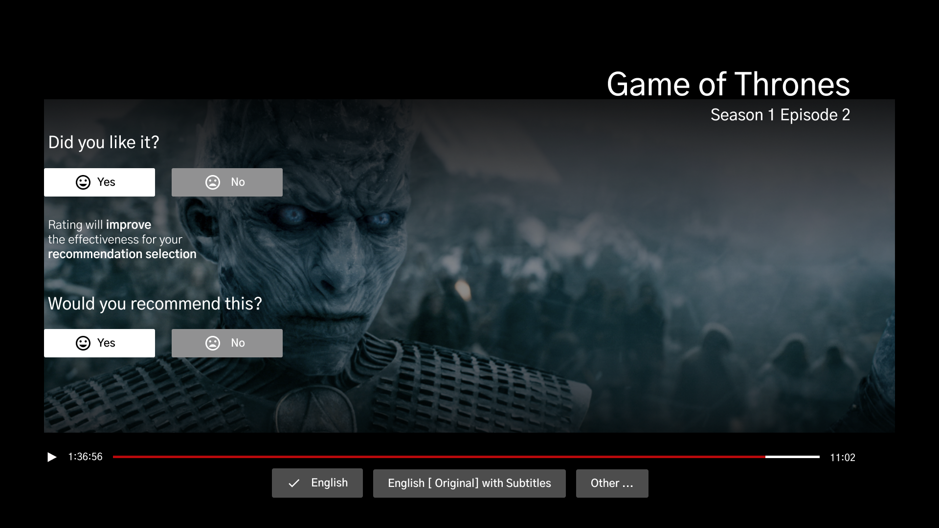
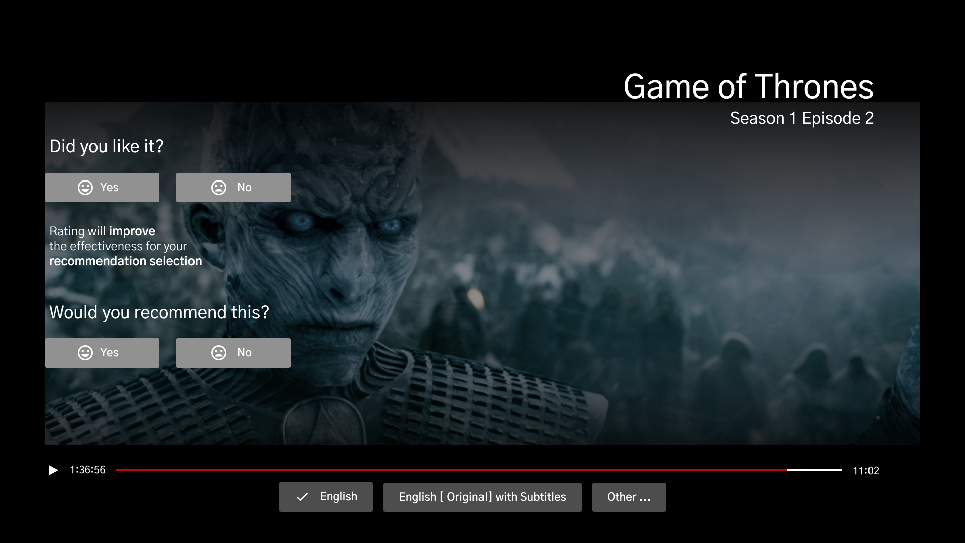
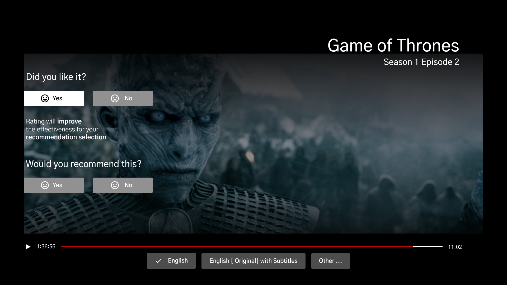
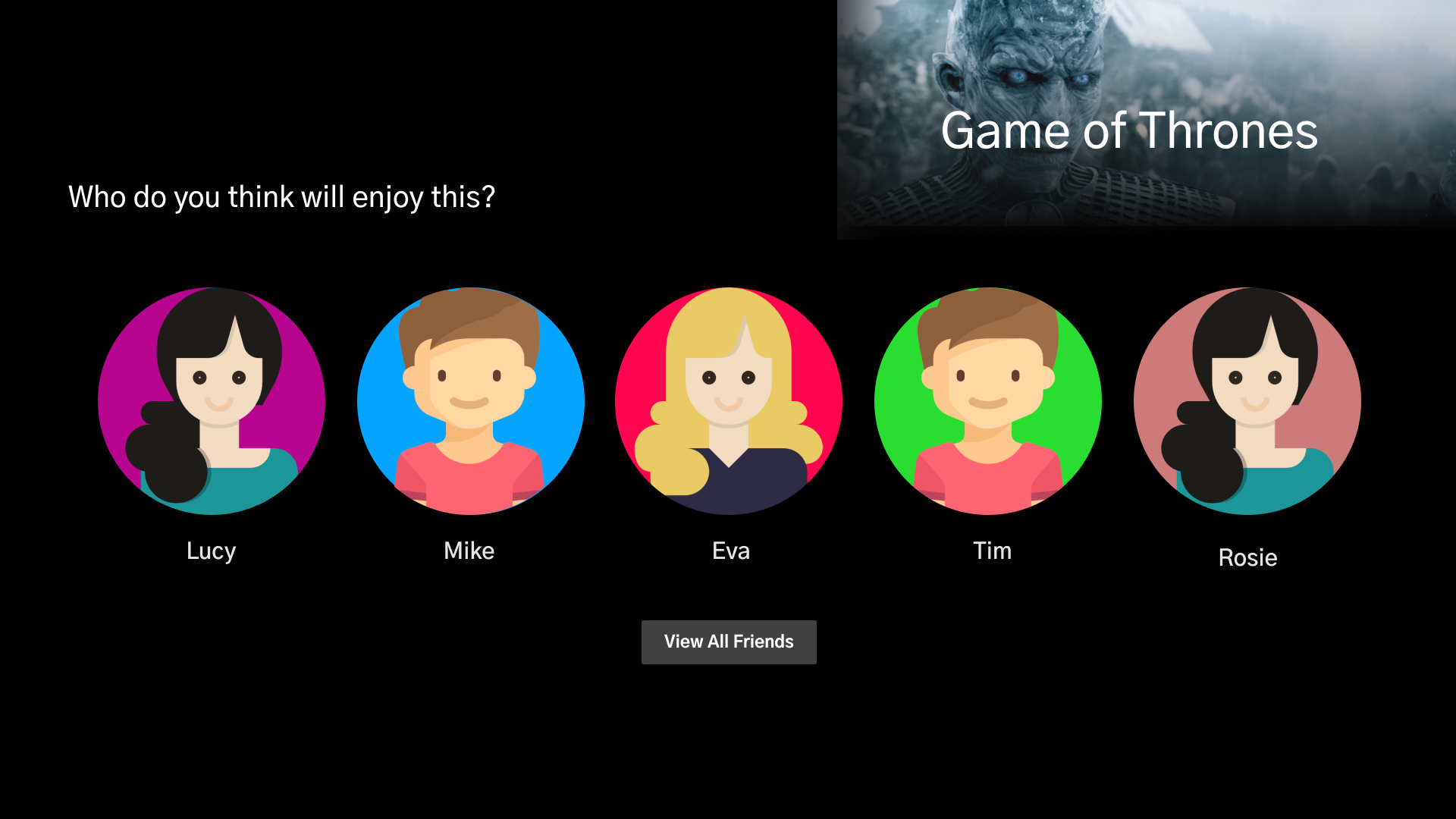
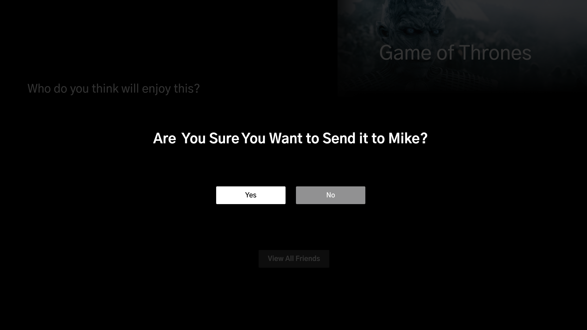
This Netflix feature will allow users to connect with their family and friends, with the option to share their interests and recommend shows, movies, or series. With the ability to rate what they have seen to optimize their recommendation list, this feature will minimize search time and present content users will be more likely to watch.
My Role
UX/UI Design, UX Researcher, Prototyping, Usability Testing
Project duration
80 Hours
July 14th -July 29th
Tools Used
Figma, Miro, Google Forms, Whimsical,Maze, Slack, Zoom, Canva, Survey Monkey
Project Overview
Background
Netflix is one of the biggest streaming platforms with over 200 million users and growing. With its personalized recommendation algorithm accuracy to match a user with their preference and taste, it has retained subscribes from other streaming services. It has certainly reigned with their great categorization of content. The human curation and social connection mainly come from watching something recommended by your family and friends which is hard to beat. It became extremely important during the pandemic as people turn to digital platforms and streaming services to keep themselves entertained.
Challenge
Netflix would like to make users feel more connected and share movies, shows, documentaries, etc. Comments & ratings between family and friends. Hoping to increase watch time vs search time while on the app and dismiss the action of abandoning the product. I will be helping them define the best way to move forward with this feature and providing them a prototype with the feature(s) you will be adding blending seamlessly with the rest of the application.
Research
⭐️ Research Goal ⭐️ Competitive Analysis
⭐️ Market Research ⭐️ User Surveys
Research Objective
There are a lot of streaming platforms, so I wanted to learn about what makes users choose Netflix originally. Then, to gain insight into how the users currently choose what to watch. Is their decision influenced by something or someone? I also want to gain a deeper understanding of their interest in sharing content with others.
Research Goal
Understand who our audience is.
Understand the user’s decision-making progress when choosing what to watch.
Determine user’s pain points, influences in the process.
Determine how connecting & sharing will influence the user’s decision.
Gain a better understanding of the importance of social connection in user’s decision-making.
Asset the impact of the current features of the decision-making progress.
Determine average time users spend looking for something to watch
Competitive Analysis
I began my competitive research analysis by exploring Netflix's top competitor's streaming platforms, analyzing their process of how they match their customers with suggested things to watch. I looked for strengths and weaknesses to identify ways for improvements within the design and deliver a shorter, successful streaming experience for our users.
Methodologies
I used three different research methodologies to identify and gain a deeper understanding of the audience and current market products available. This allowed me to further familiarize myself with the streaming services industry, and identify areas for enhancement.
Competitive Analysis – this will allow me to see what similar platforms are doing to offer user’s recommendations, identify frustrations and pain points to improve and make them more feasible. This will help me compare what other streaming platforms are offering regarding personal recommendations and suggestions
Market Research – conduct research by reading and gaining a better understanding of streaming platforms, understand industry and target audience
Questioner/Survey – Understand the decision-making progress from a large group of people, current likes/dislikes. Participants will be sent a survey with various questions to complete and return.
Market & Secondary Research
Reading online resources, helped me gain knowledge of universal streaming platforms and the direction of growth in the value of the market. This allowed me to focus on defining the scope of the design process and ways to incorporate it for optimal results.
Besides reviewing competitors and researching the market, I have also been able to observe a handful of people streaming on multiple platforms to discover their current emotional experiences, actions, and behaviors they express in the process of selecting content to watch.
The Global Video Streaming market is expected to grow around 20% from 2021-2027
Due to ease in remote access and portability, smartphones and tablets are more likely to be preferred for online content watching.
Lockdown has increased subscriptions and the rise in the online streaming social platforms by 12 % since 2020
Globally, Netflix holds more than half the video streamed over the internet
The video streaming services have experienced a rise of around 10% in viewership during the lockdown.
More than half of US households are subscribed to multiple streaming services
Younger adults are more active streamers ages 18-44
Top streaming platforms are: Netflix, Disney+, Hulu, Amazon Prime, HBO Max
User Survey’s
I decided to use surveys because it enabled me to reach a wider audience from all over, and the responses will be essential in delivering a versatile product. I administered them to 4- 7 current Netflix subscribers that frequently use the streaming platform than, summarized my previous findings, and constructed a Survey Script ncluding a handful of questions for my participants to take part in user interviews as a part of my research.
My Objective
Gain knowledge of how users currently choose what to watch
Learn what influences their decision to select what to watch (recommendation, word of mouth, etc.)
How often do the users watch something that is recommended by Netflix?
How likely is Netflix to add this feature to their platform?
Key Findings
Define
⭐️ User Persona ⭐️ Empathy Map
User Persona
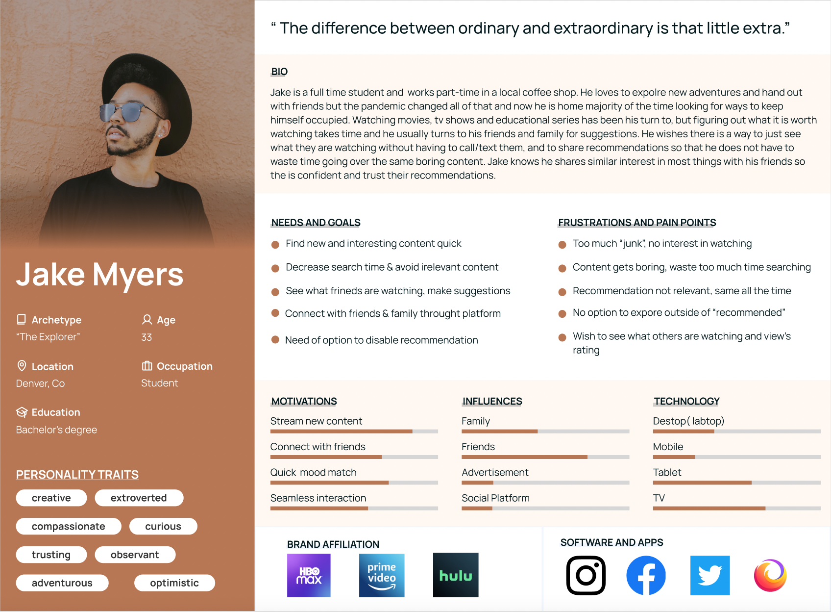
Once I gathered information from my research, I learned that current subscribers become bored with the shuffling of the same content. They find themselves being interested in what their friends are watching and like the idea of sharing. Having the online option is great for subscribers who have a hard time choosing something to watch to quickly accept friendly suggestions and eliminate the search window. I created the user persona Jake, who embodies the needs, frustrations, and goals of the audience.
Empathy Map
I created this empathy map to gain a deeper understanding of our users, helping me visualize what I know about my audience and create an understanding of their needs, what they feel, say, and think. This allowed me to use a customer-centric approach and focus on empathizing with users to be able to comprehend what they are feeling and experiencing when putting myself in their shoes.
Ideate
⭐️ Site Map ⭐️ Task Flows
⭐️ Mid Fidelity Wireframes ⭐️ High Fidelity Wireframes
Site Map
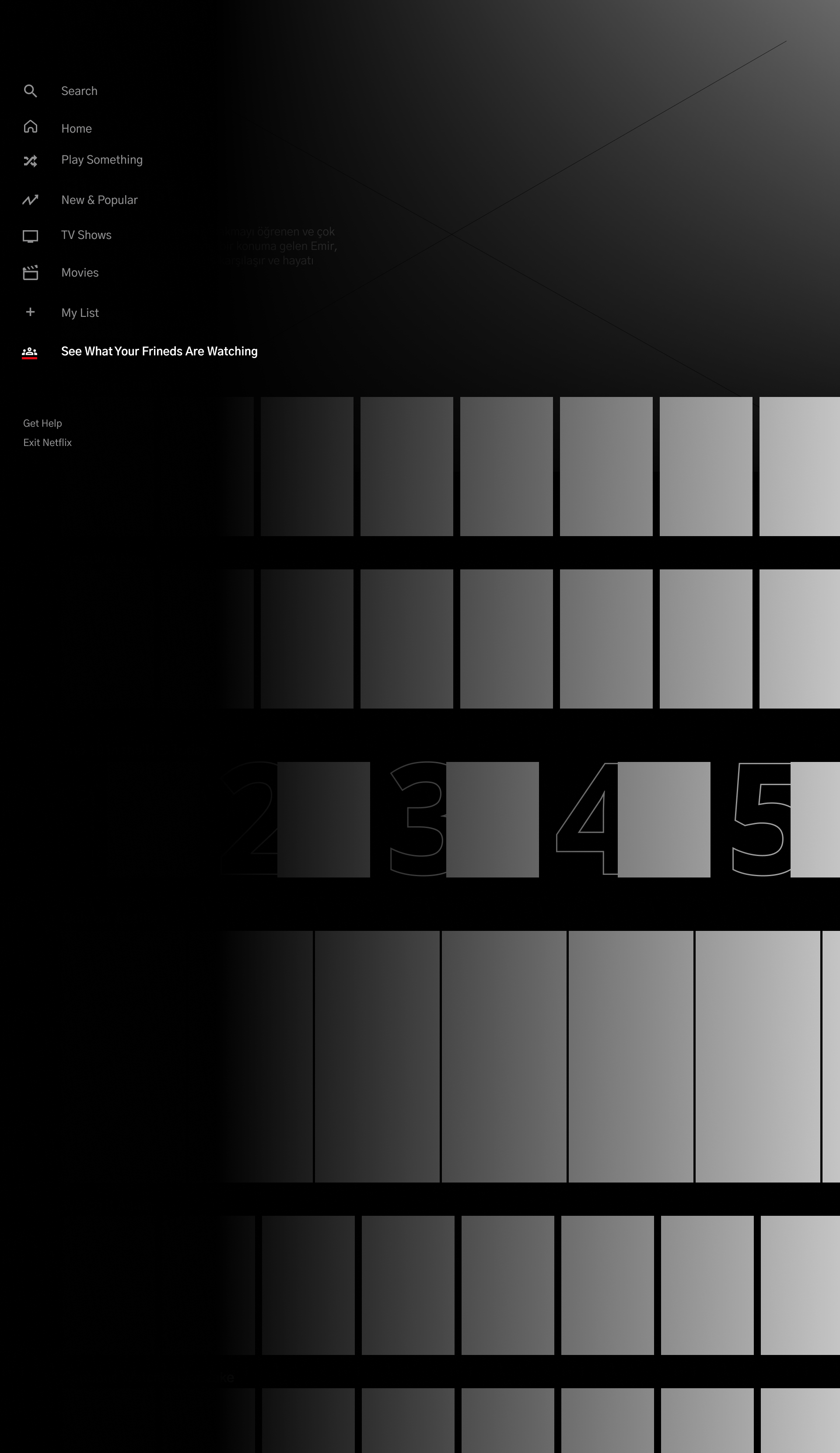
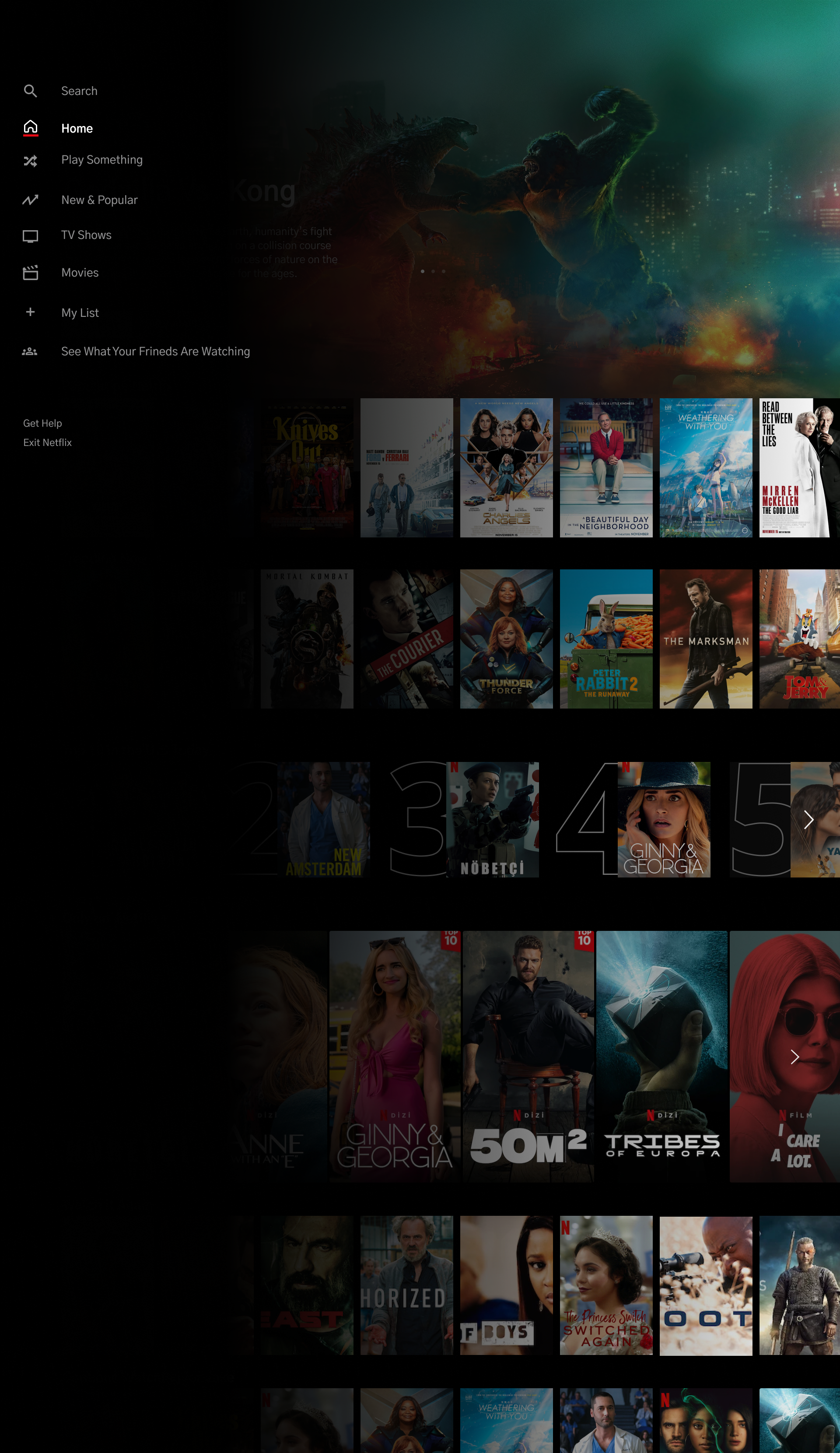
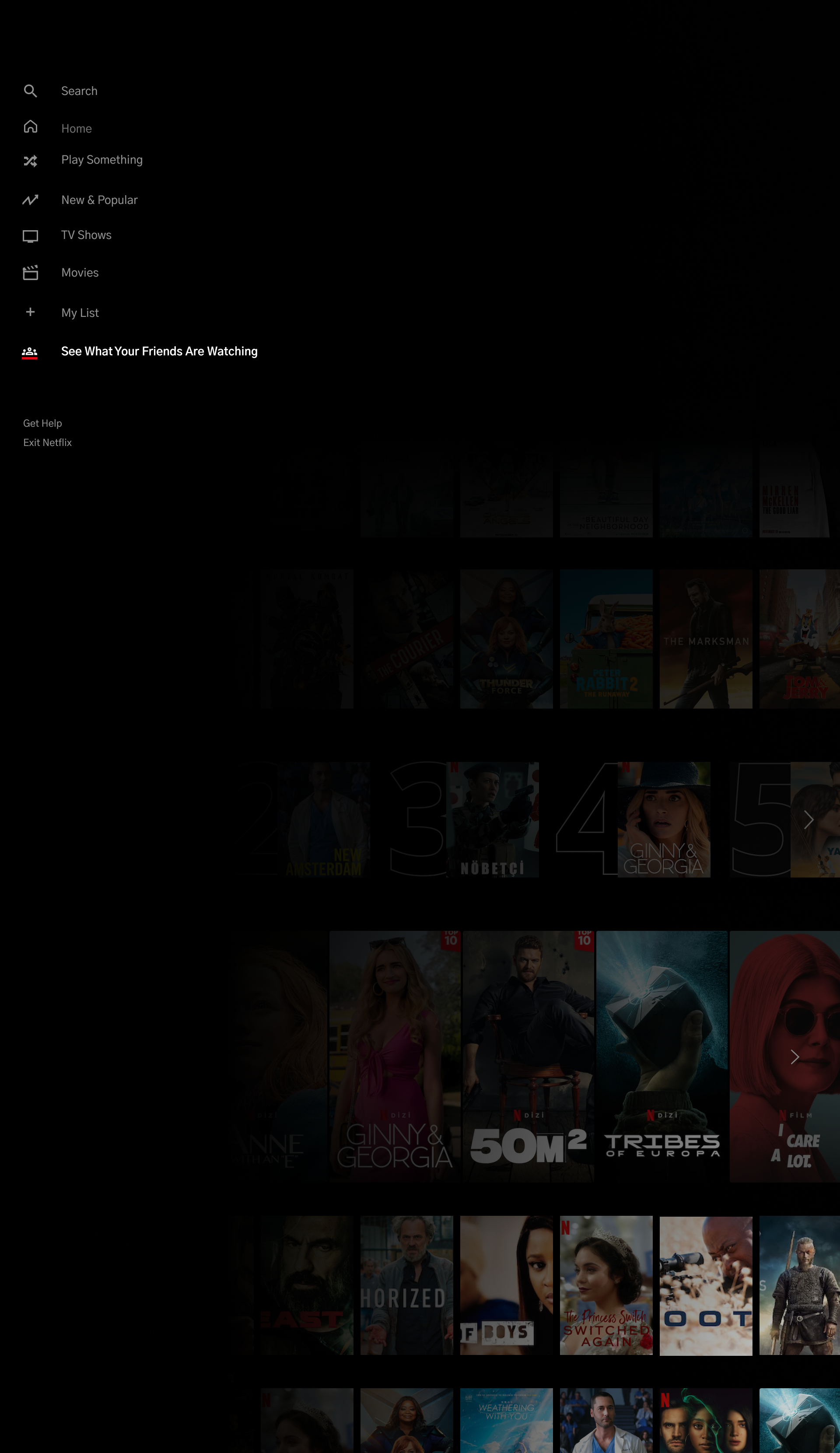
After reviewing the research findings I created a sitemap to help me visualize where best to incorporate the new feature and how a user would navigate the existing application with the new feature into it. I organized the content using the application's current categories set up and focused on simply blending the feature within the pre-existing navigation. I will use this to design my lo and mid-fidelity wireframes. I realized this part is important because it helped me visualize if the existing information architecture could support my new features, and if there is room for alteration. Fortunately, the existing visual hierarchy allowed me to integrate my feature seamlessly into the navigation menu.
Task & User Flows
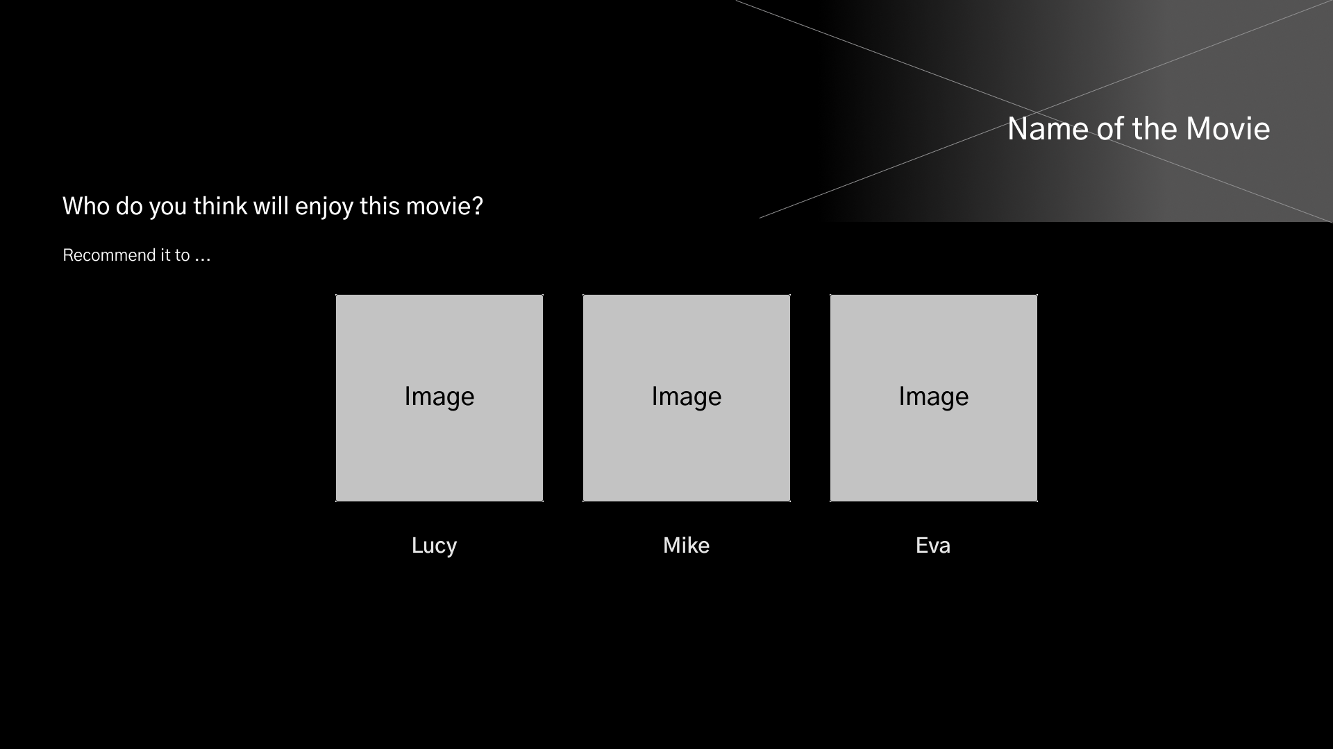
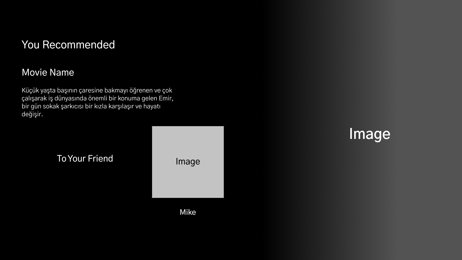
In order to understand the user's journey and visualize the navigation of the application from the user's perspective, I created two main task flows: choosing to start sharing and viewing a friend's library and the process of recommending something to a friend. Creating these tasks gave me the perception of the screens and paths I needed to construct for the user to be able to complete them.
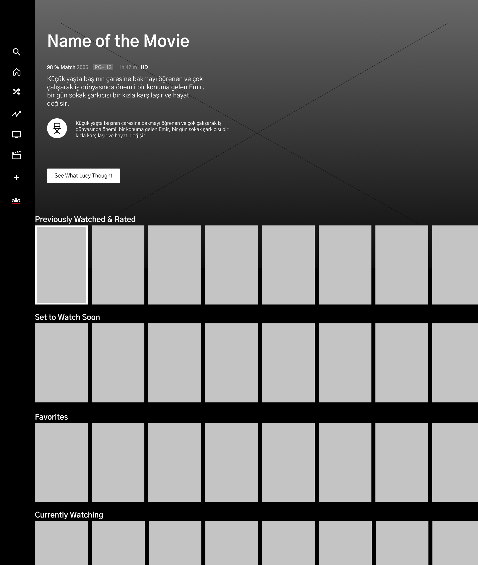
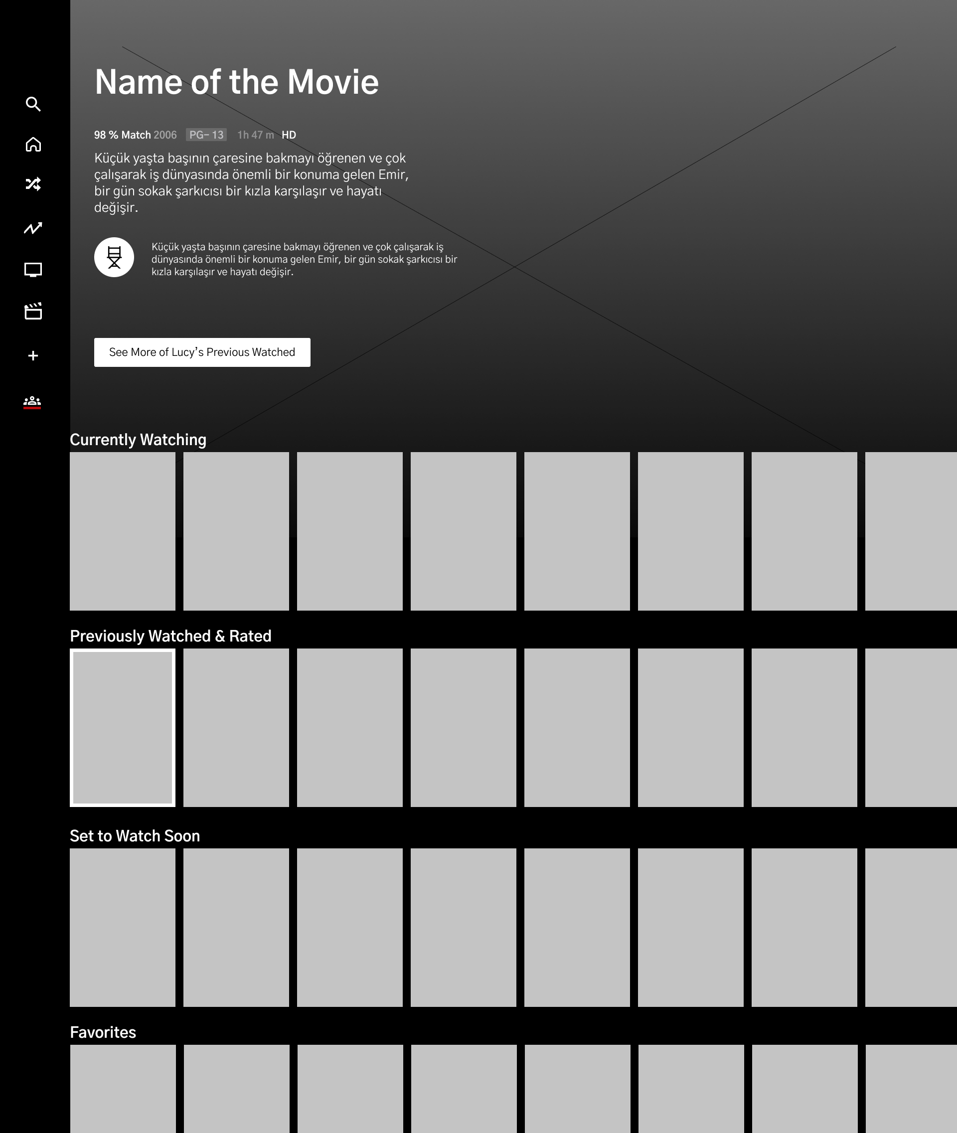
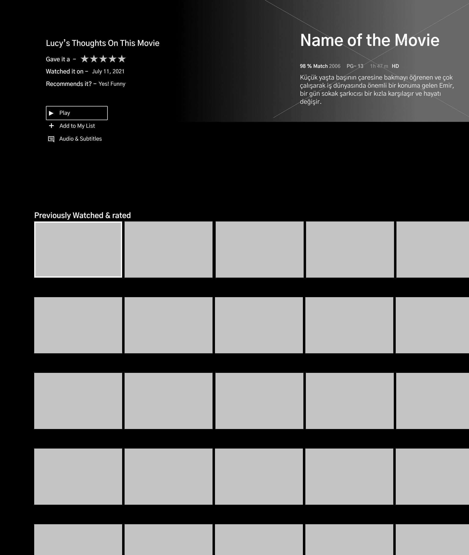
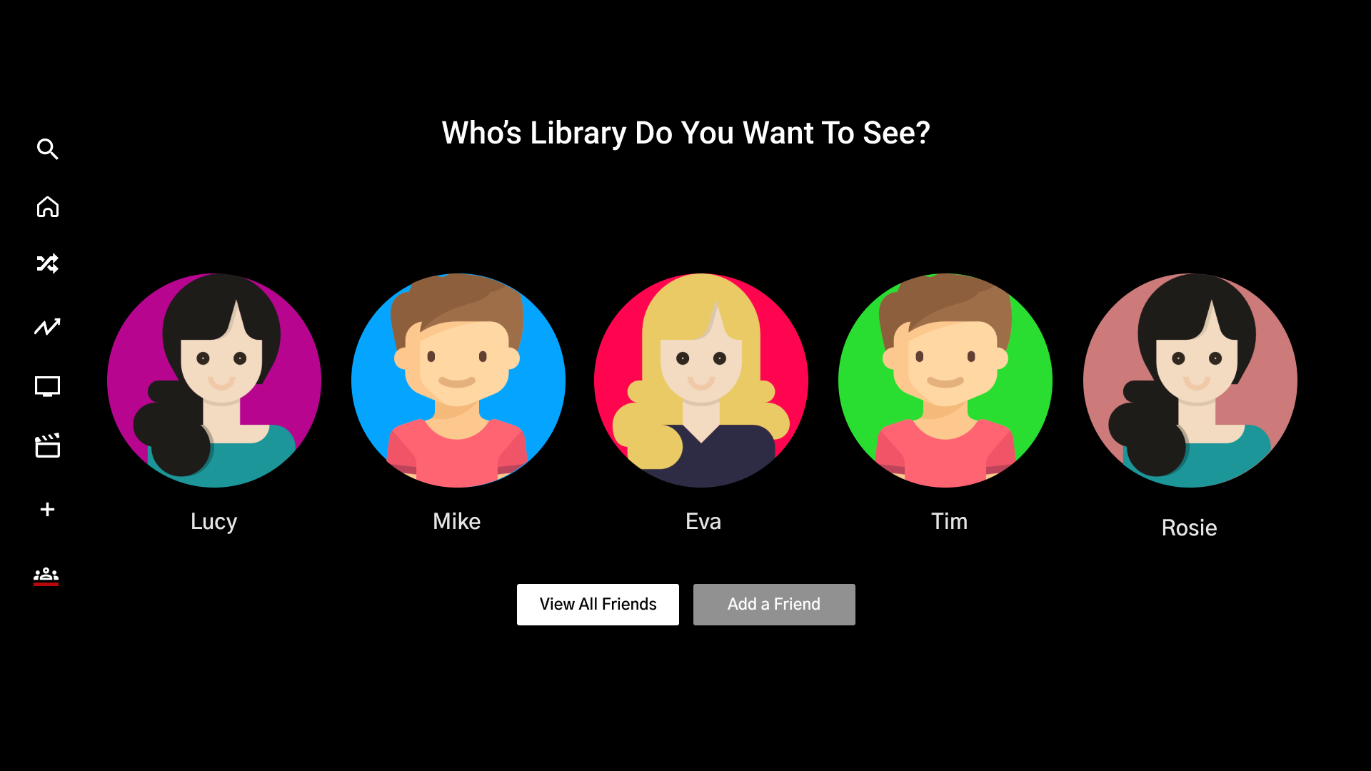
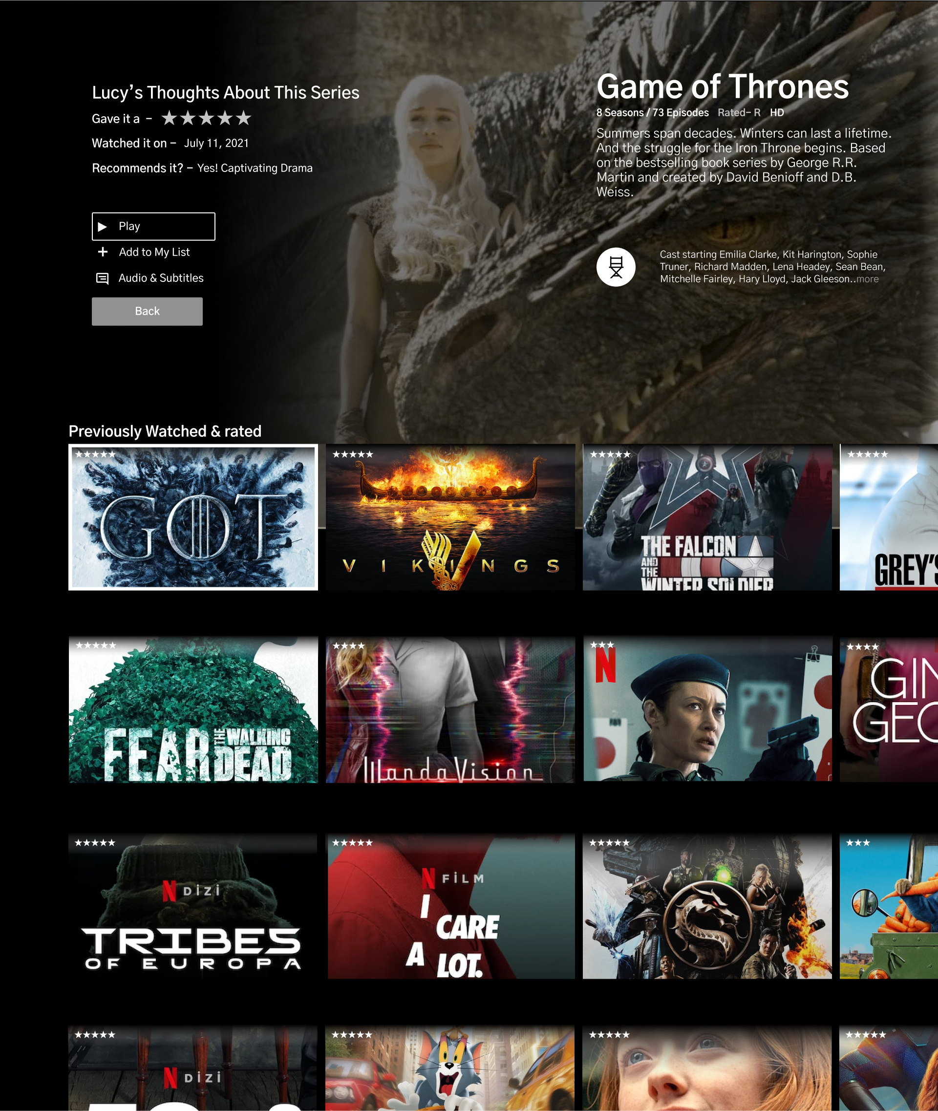
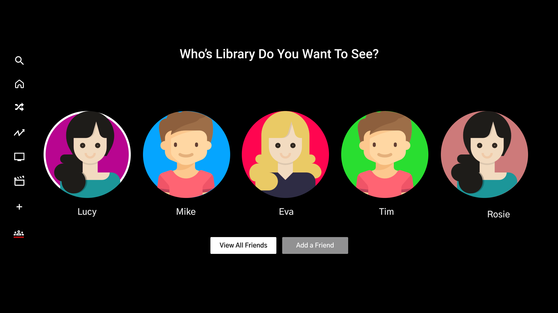
The first task - Shows how a user will be able to see what a certain friend is watching and the option to select something to watch from their “previously watched”. I wanted to make this flow as easy and straightforward as possible.
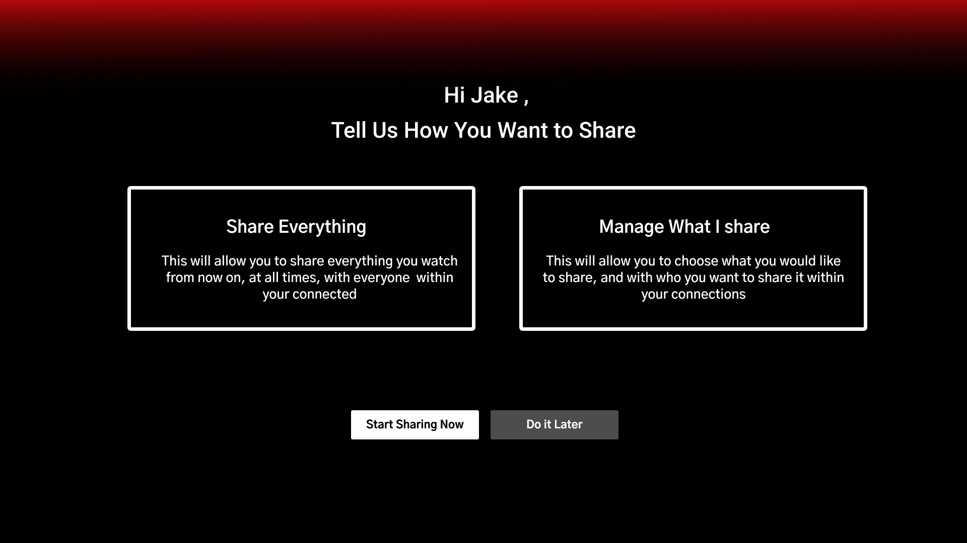
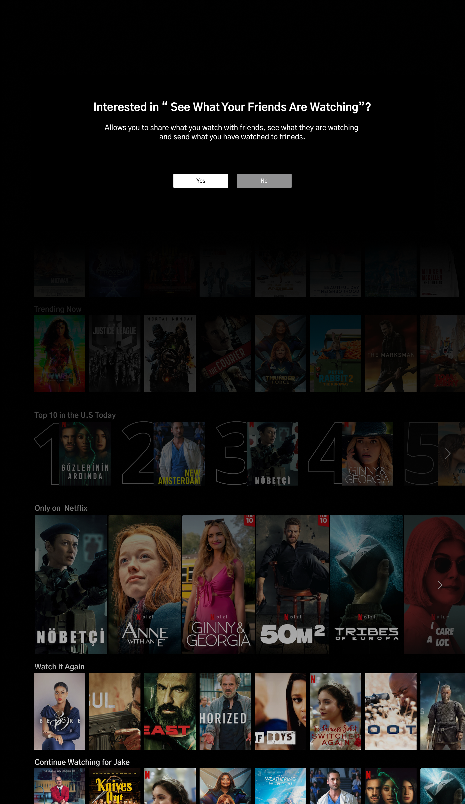
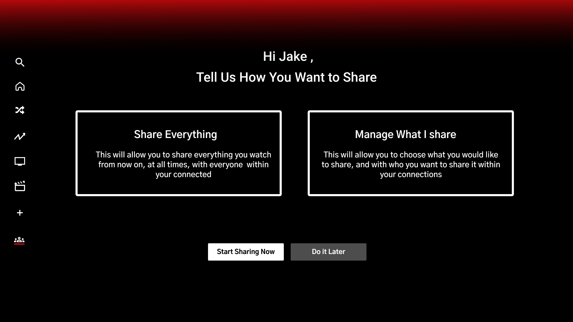
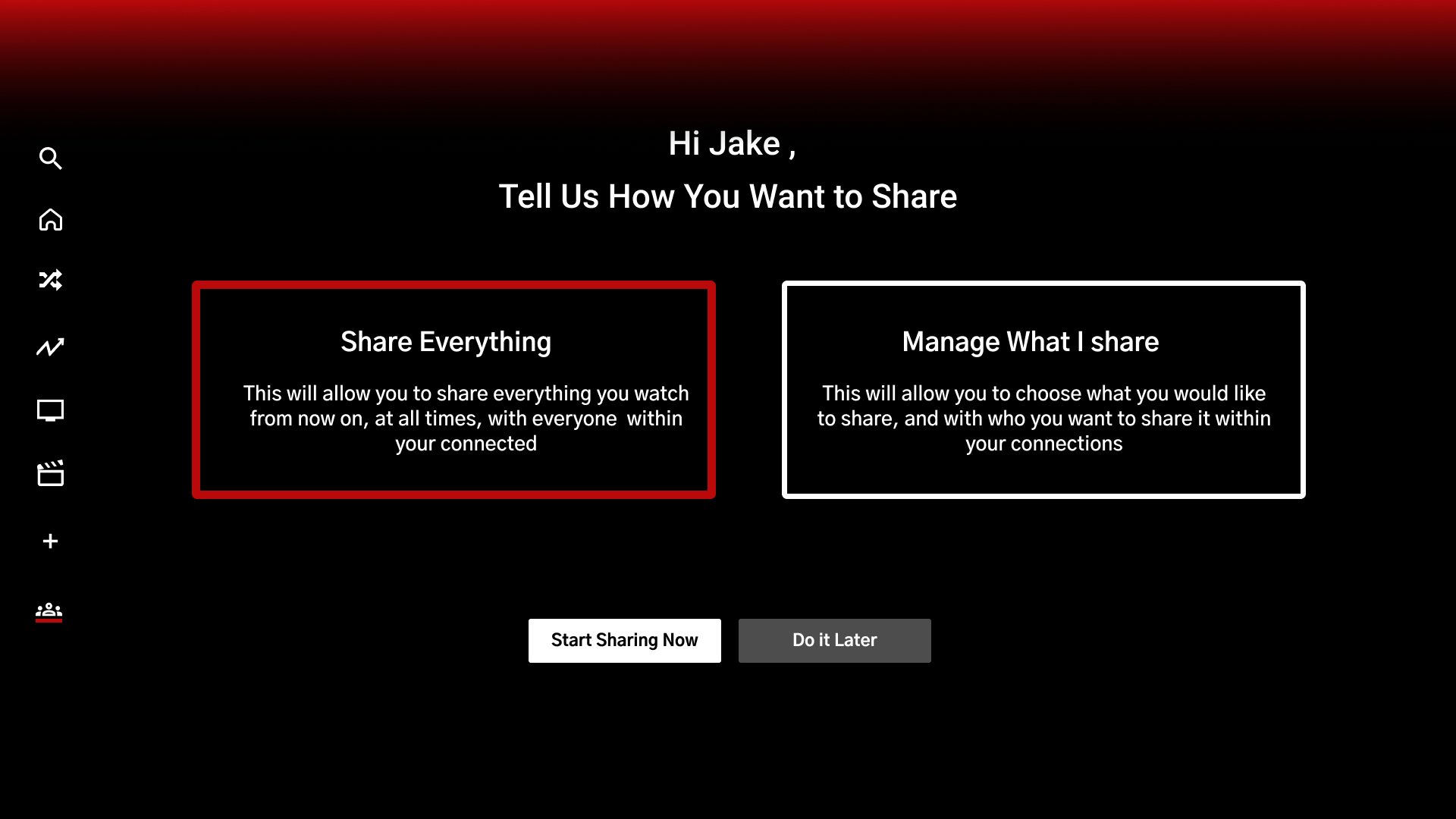
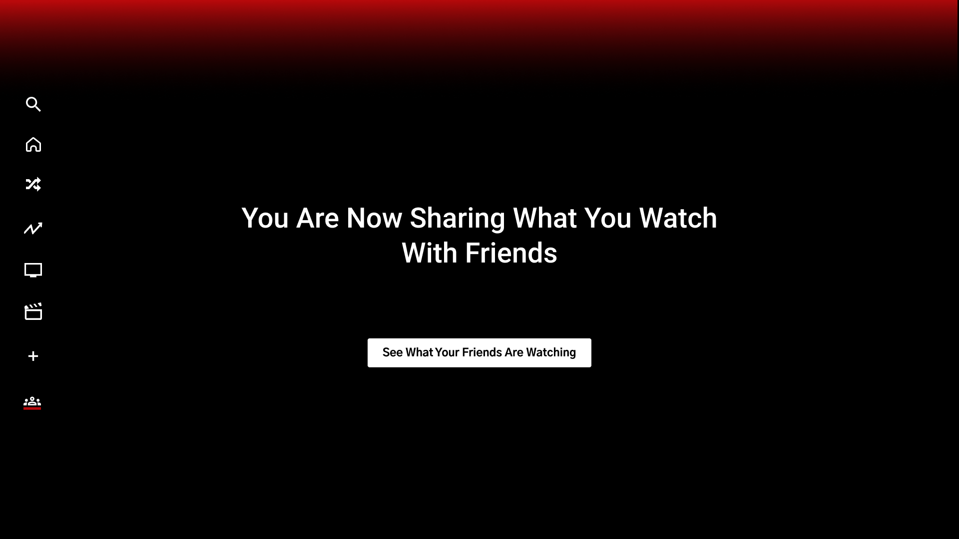
Second task - Part of the initial onboarding process, when the user first opens the app with the new feature added and gets familiar with how to use it, manage it, and disable it.
Mid Fidelity Wireframes
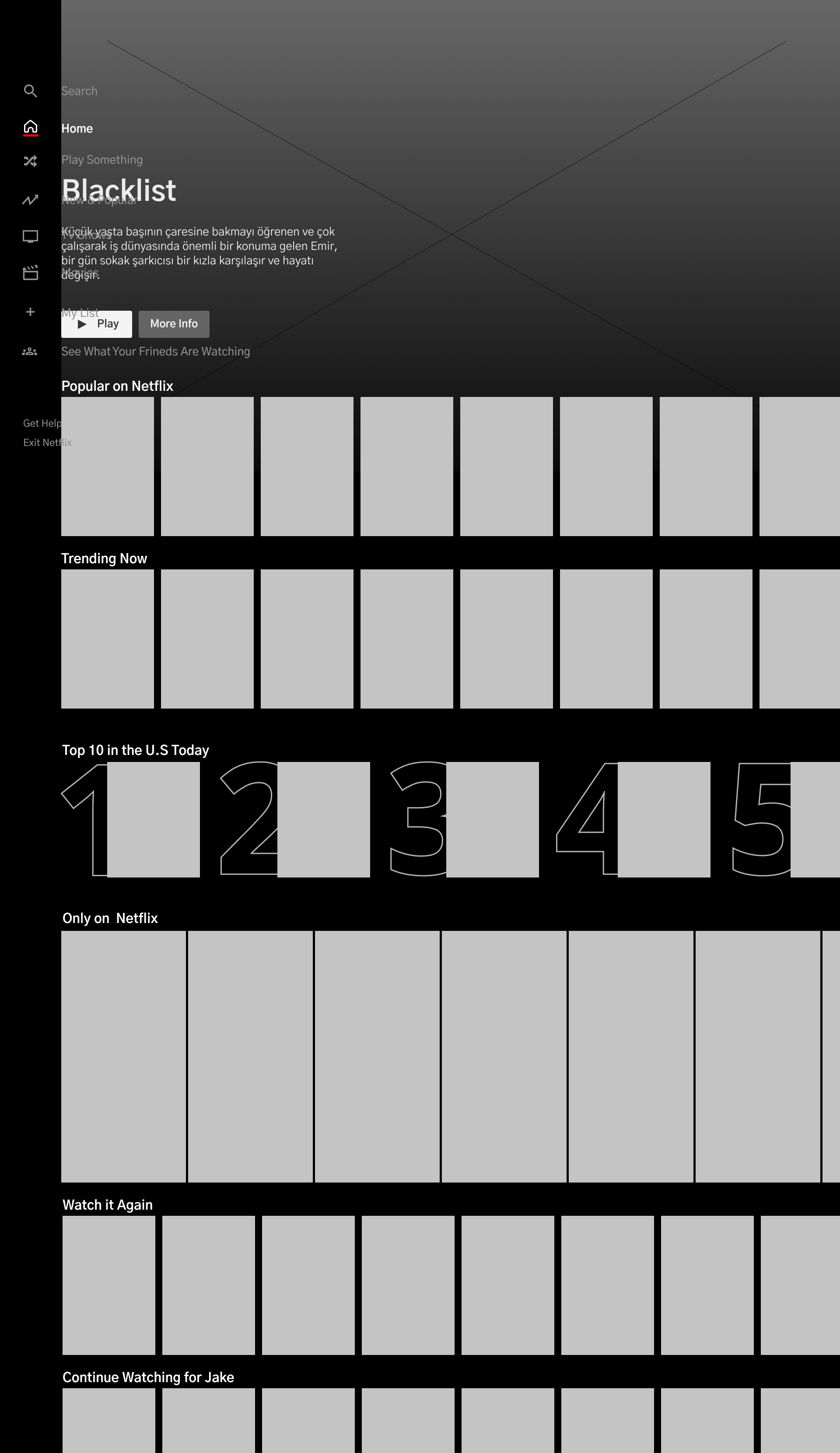
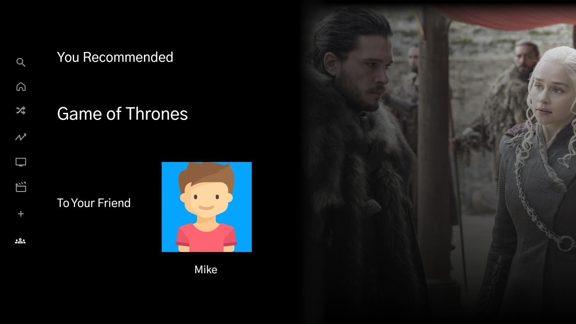
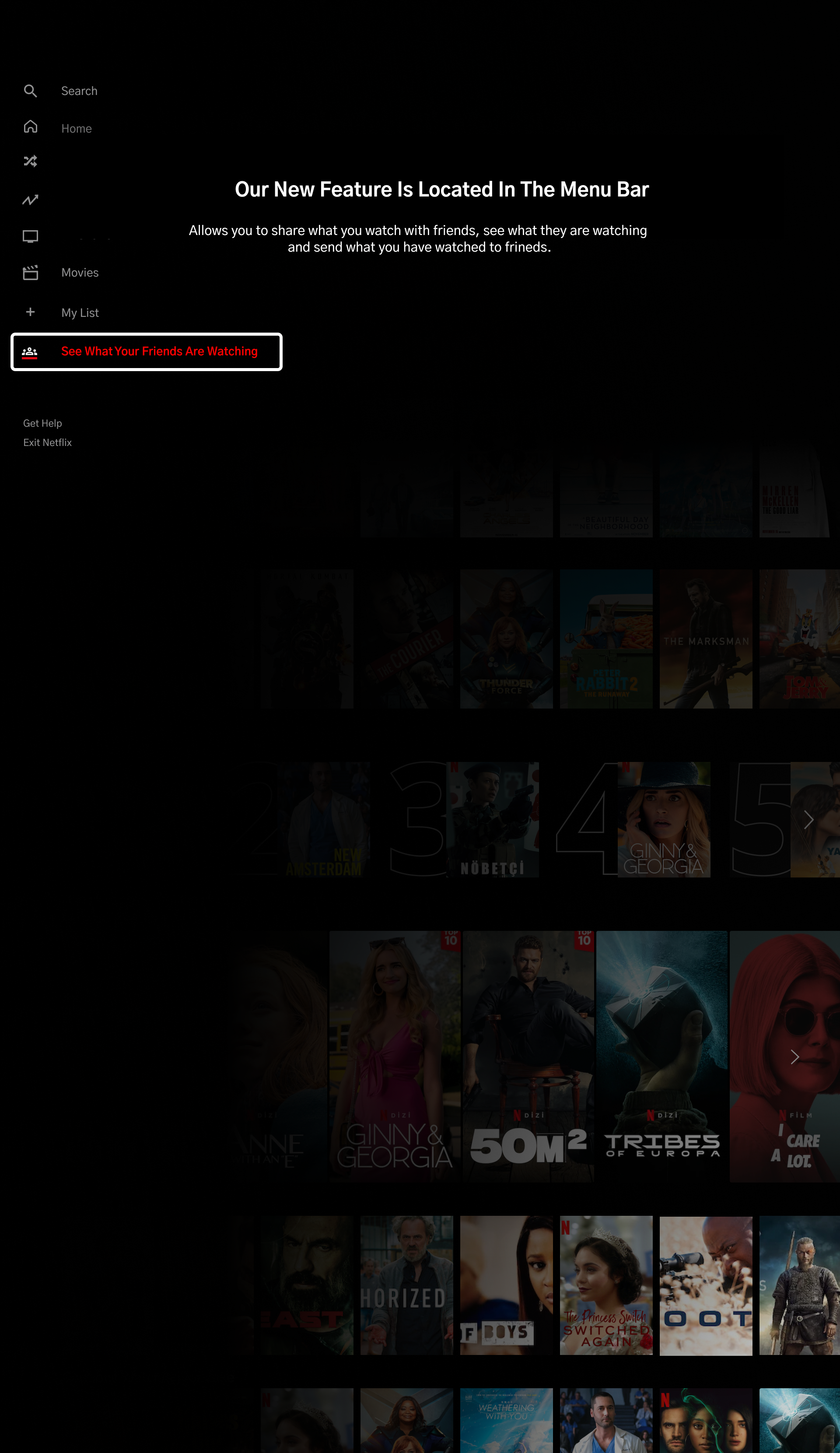
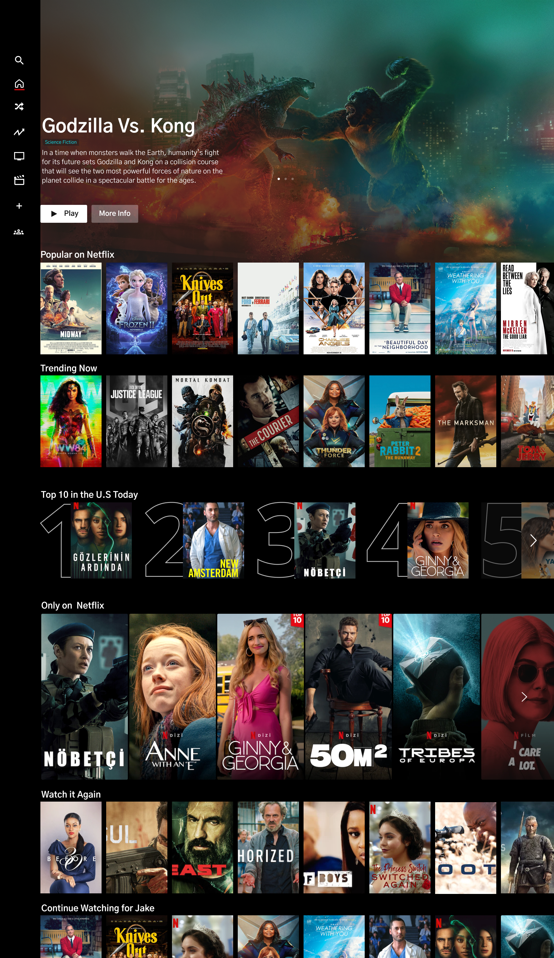
I concentrated on working through the current Netflix application to understand where this feature could fit in terms of functionality. I utilized my research findings and task flows to sketch out the initial layout then modifying the design to support the integration of the new feature. I wanted minimum disruption to the current design to avoid users the increase of users' cognitive load. The following wireframes exhibit the key concepts of understanding the new feature and an easy way to view your friend's library.
High Fidelity Wireframes
I used my initial mid-fidelity wireframes to create the high fidelity mockups and prototype for Netflix, to illustrate how I would aesthetically implement key elements by using the application's current brand’s style guide. Keeping my goal in mind and providing the users with a simple and familiar way to connect with friends. Adding the UI elements to the mid-wireframes helped me put in perspective the functionality of the feature and the process of competing for each task.
Prototype
⭐️ UI Kit ⭐️ Prototype
UI Kit
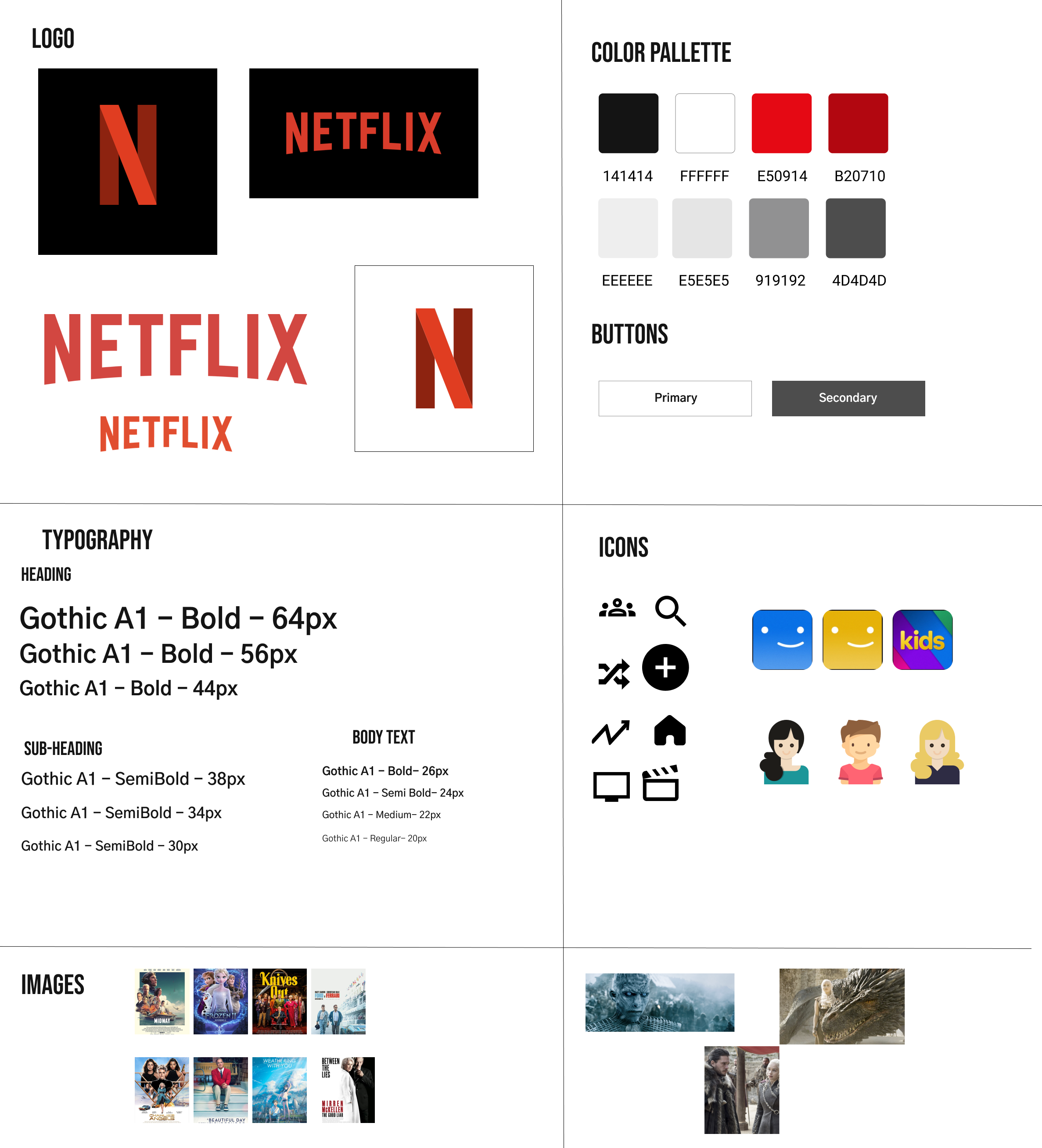
For the UI Kit, I chose to use the existing NETFLIX UI Kit and brand colors for continent visual hierarchy representation. I reference these components throughout my project to make sure the elements align with the company’s branding.
Prototype
Using the high-fidelity wireframes and my research findings, I created the first prototype in Figma and conducted usability testing of the processes. I used this to identify any room form improvements and observe the feature’s functionality within the platform needed to complete both tasks of begging to share and recommend.
Test & Iterate
⭐️ Usability Testing ⭐️ Affinity Map
⭐️Iterations & Review ⭐️Implement & Improvem
Usability Testing
Goals & Objectives
Gain knowledge of how users currently choose what to watch
Learn if they are interested in what their friends are watching
What type of sharing would they like, everything or manage.
User rate of how likely they are to use this feature in real life
Identify user’s pain points, influences in the process
Determine the user’s success of the navigation process during the tasks of sharing and recommending
Observe and note any pain points, frustration, confusion
Key Findings
All participants found it a little confusing at first on the home screen
Most participants were looking for a back button to return to previous
Some participants shared they would like to share in a fewer step
Most participants would like to view the ‘friend” screen in a different way than the “Log In / Who is watching’ Screen
Most participants wanted a clearer description of the sharing feature and what it entails
Most participants wanted to click on both options of the share version
Insights
Users really liked the feature because it saves them time to call friends and ask them for suggestions/recommendations, they can access it anytime
Most of the users do not like the Netflix current algorithm and find themselves browsing through the same content ( annoying)
All users were surprised to discover they share an interest with friends and almost always watch what someone has recommended because they feel connected to the person and trust them
Affinity Map
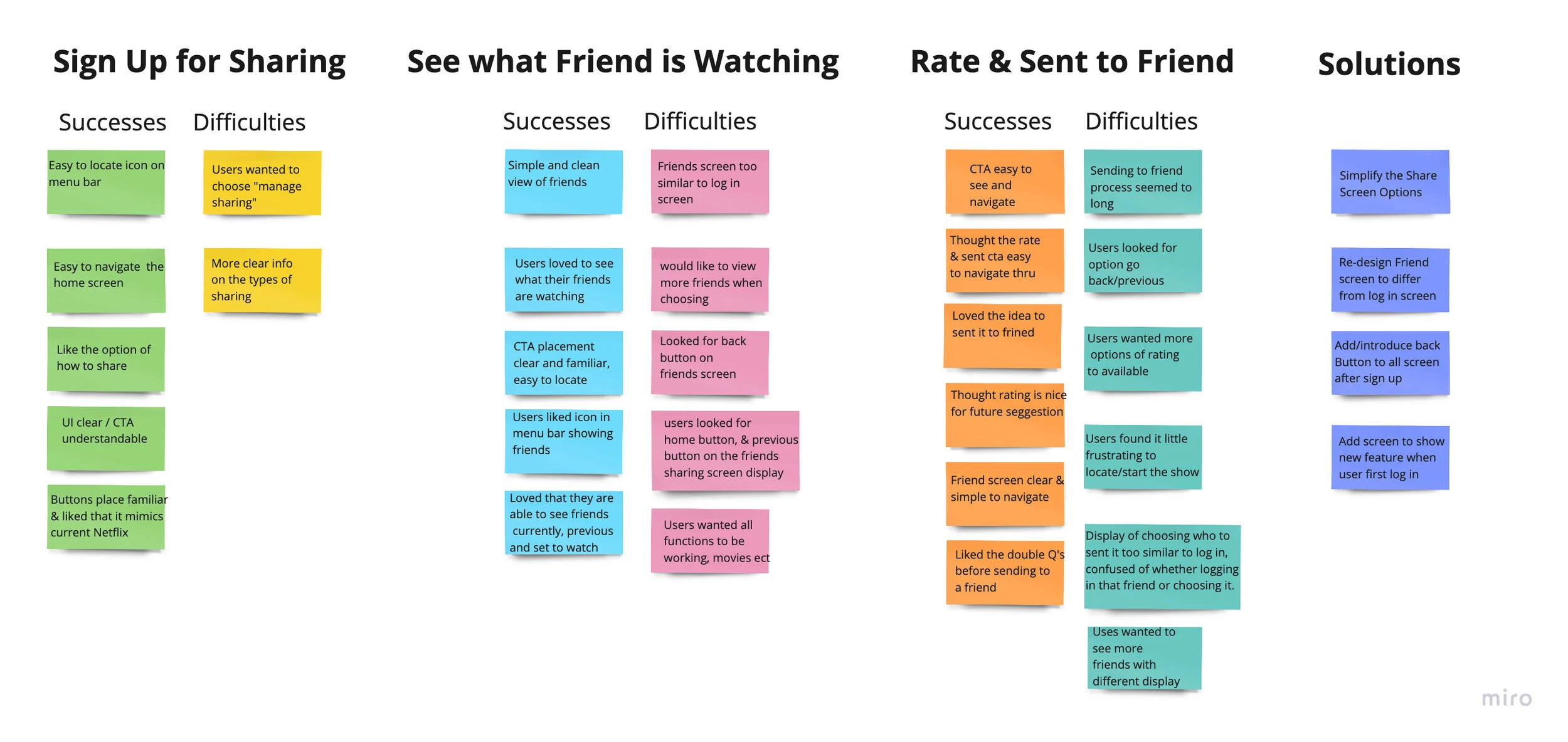
The feedback I received from my user testing phase helped me gained valuable insight into the participant's process of navigating through the feature. I received some positive feedback about the simplicity of the feature itself and the option of having this would particularly relieve some of the stress of selecting what to watch. To create my affinity map I used Miro, which groups the user’s successes and difficulties they encountered during each task they were asked to complete and presents the solutions I recommended to resolve the high tier frustrations.
Iterate & Implement
Using my initial high-fidelity prototype, I was able to conduct usability testing with 7 participants. Each of the participants was asked to complete task one of seeing what their friend is watching and recommending a show to a new friend. Once I combined my research information from the user surveys and usability testing, I was able to emphasize the screen and functions I needed to re-work.
I wanted the user to be comfortable using the new feature, therefore I added two onboarding screens. Providing the user with guided instructions where they were able to get familiar with where the feature is, what it does, and how they can use it. With familiar knowledge, I wanted the onboarding to be presented in few simple steps when the user first logs into their Netflix account with easy and quick navigation.
Added the menu bar on the left on every screen to allow the user to have the ability to choose other functions and return home at any point.
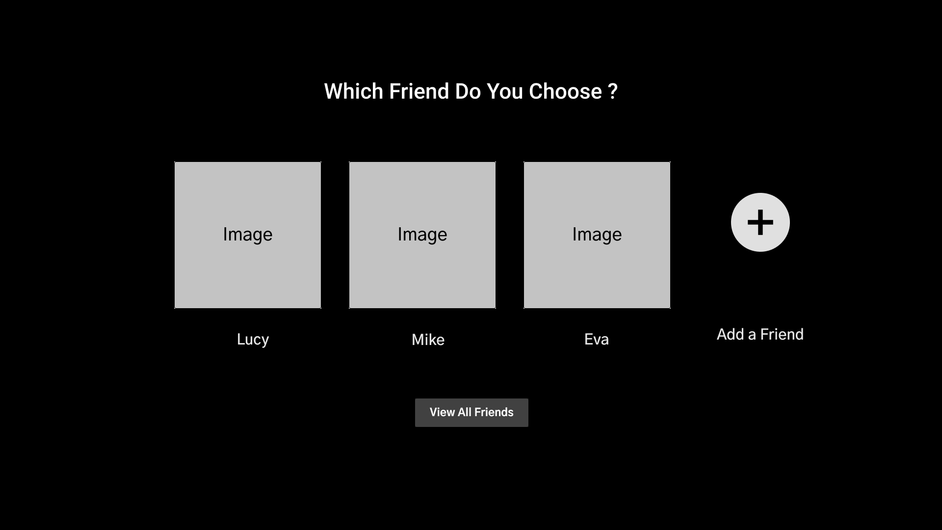
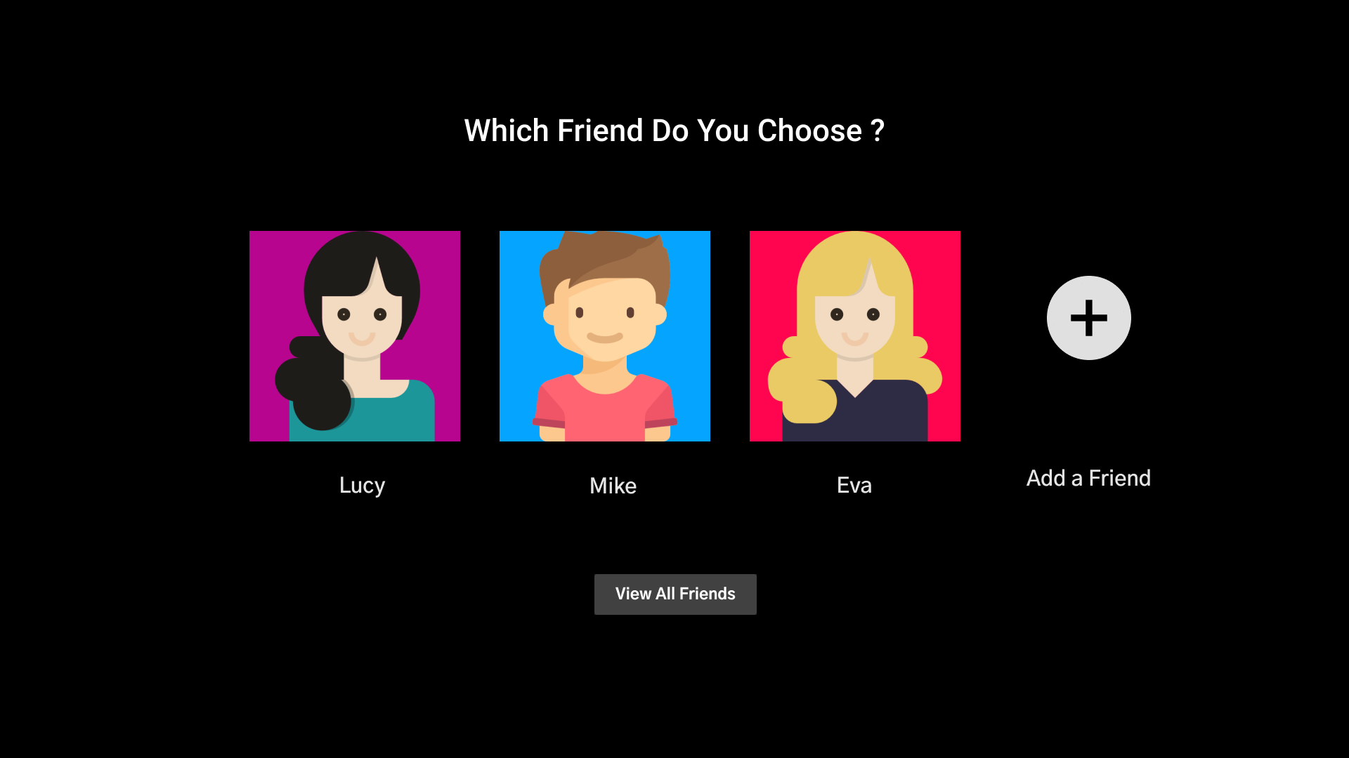
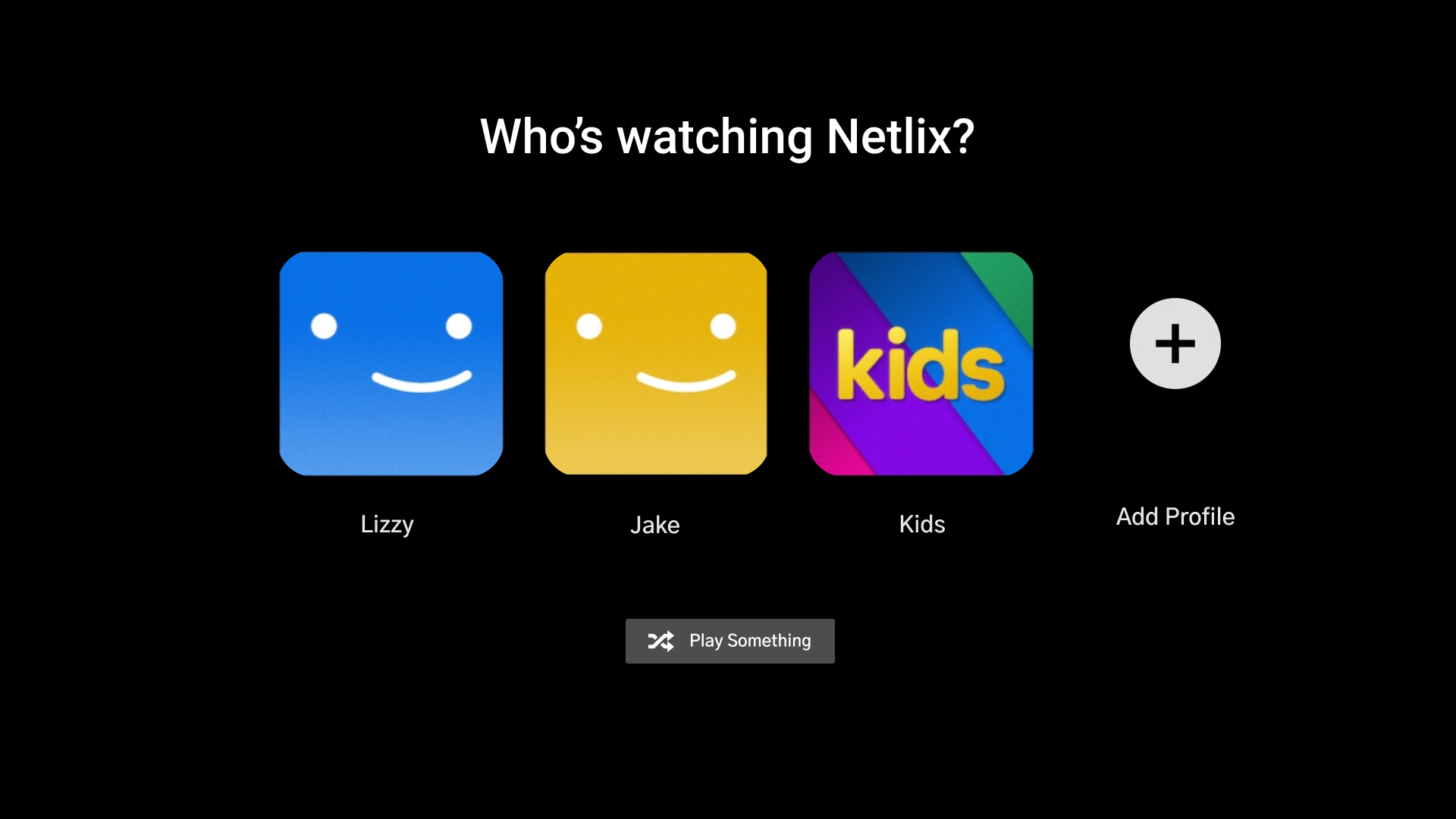
Also made the "friend display" different than the login screen in order to allow the user to visually differentiate which screen they are currently on. Eliminating the confusion between the login screen and the friend's list.
Added a Back Button on the screens providing the user with the option to return to the previous page instead of starting from the beginning. This will allow the user to quickly return to similar content of selections where they can easily succeed in the task they are choosing to complete.
Final Revisions
With the revisions and implementations completed, I finalized the Netflix Final Prototype in Figma.
You can view the prototype by clicking the button under, or scrolling to the top or bottom of this page.
Final Thoughts
Netflix invests a lot into their user experience and leaves very few stones upturned to gather data. As a result, research from competitor apps, close friends, and family was integral to developing my proposed feature. The user testing was also a key learning experience as I was able to fix usability issues that I had originally overlooked. At first, implementing the "See what your friends are watching” feature placement may look effortless, but it was challenging to work within the style guide constraints and to figure out where exactly the new feature would be seamlessly integrated. I learned that simplicity is a strength and designing a feature to simply deliver what the users are looking for is a crucial and valuable experience.
Phase 2: Next Steps
Add screens to show how the user can manage what they share
Introduce an option to watch together with friends
Improve current UI and add personalization of profile & watch history


