Trips for Kids
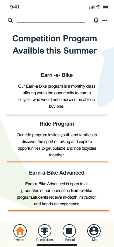
Trips for Kids is s non-profit organization providing transformative cycling experiences for underserved youth. This app will offer healthy informative choices for all families and children, bringing individual and collective accomplishment through friendly competition with options to win customized prizes.es.
My Role
UX/UI Design, UX Researcher, Prototyping, Usability Testing
Project duration
80 Hours
June 28th-July 12th
Tools Used
Figma, Miro, Google Forms, Whimsical,Maze, Canva, Slack, Zoom
Project Overview
Company Background
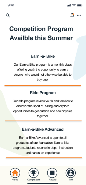
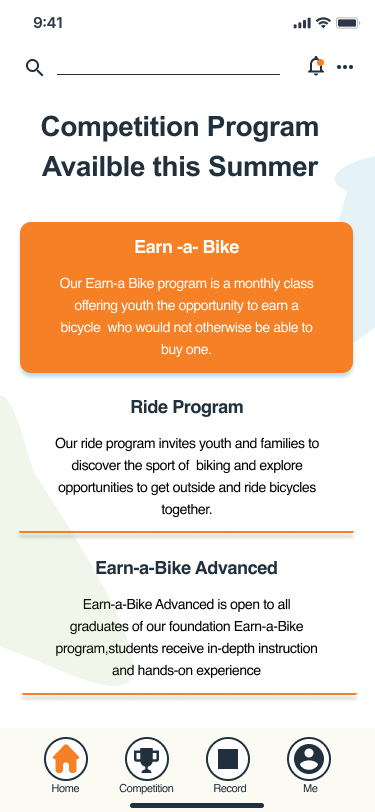
Trips for Kids is the nation’s largest, oldest, and most diverse youth development bicycling organization. Started in 1988, it has grown and provided young people and families with knowledge, motivation, health, environmental awareness, recreational lifestyle, and personal empowerment from their bicycle programs throughout the US and Canada. Since 2000, Trips For Kids Charlotte has provided transformative cycling experiences for underserved youth. Operation through three main programs, Ride Program, Earn-a-Bike, and Earn-a-Bike Advanced. These programs are helping to combat the physical inactivity crisis, promote equitable access to safe places to play and exercise, provide opportunities for physical activity in and out of school, and build self-esteem, personal skills, and learn environmental stewardship, thus mentoring youth to achieve better life outcomes.
Challenge
Trips For Kids envisions a future of empowered, self-sufficient catalysts of change in their community. They believe that the bicycle is a tool of social change and the connector vehicle for opportunity and want to encourage and educate children and families on the many benefits of cycling. Adding a mobile app that offers sign-ups for program and competitions that you can share progress with fellow competitors for a chance to not only win a bike but customize it and much more, it will transpire the organization growth in a positive direction.

Research Objective
I want to know if introducing a way they can compete with other kids enrolled in the competition for a prize to earn & customize a bike would encourage more children to join. What would they like to see tracked and how would this increase their personal growth? How would they like to see and track their competition progress, key interest & pain points?
Research Goal
We want to know if introducing a way they can compete with other kids enrolled in the competition for a prize to earn & customize a bike would encourage more children to join.
What would they like to see tracked and how would this increase their personal growth?
How would they like to see and track their competition progress, key interest & pain points?
Understand what users would like to see about each competition and user’s motivation for completing the task
Gain knowledge of user’s product use and satisfaction
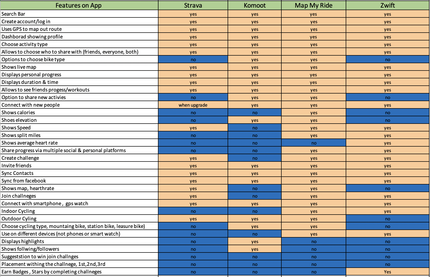
Identify key pain points in competitors and improve them
Understand what attracts kids to competitions and how they view competing overall
Competitive Analysis
I began my competitive research by view competitors' mobile applications to familiarize myself with their process and to gain insights into what improvements and simplifications could be made to improve this design and make it more user-friendly, fun, and enjoyable. With my knowledge of similar products, I also used the internet, social media, and friends to further explore the competitors, their limitations, and successes.
Market Research Analysis
This helped to gain insight into the current volume and value of the bicycle market:
The global bicycle market is expected to expand at an annual growth rate of 7.0% from 2021 to 2028. The increase in the number of people opting for bicycling as a form of leisure is anticipated to propel the growth.
Preference for bicycles as a convenient form of exercise to ensure a healthy life, free from obesity and other disorders, is expected to further drive the market expansion.
People have started realizing the importance of staying fit and having a healthy life. They have also started realizing that regular bicycling can keep disorders, such as obesity, at bay. The market is likely to grow as more and more people are resorting to bicycling as a regular form of exercise
The road bicycle segment accounted for the largest revenue share of 41.1% in 2020 and is expected to remain dominant over the forecast period
The growing trend among people to customize road bicycles for specific purposes is also expected to contribute to the segment growth in the forthcoming years.
The Mountain bicycle segment is also expected to grow significantly particularly millennials
The global mobile application market is expected to grow at an annual growth rate (of 11.5% from 2020 to 2027
The main use of tracking progress, location, share is mobile apps
User Interviews
I conducted 5 interviews, participants ages 21-30 with previous and current knowledge of similar products they use to track their physical activities.
Key findings:
Most participants like to compete and currently own a bike
All participants do the physical activity outdoors, most tracked activity is biking, running and cycling
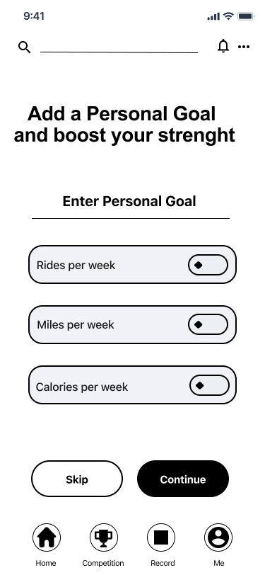
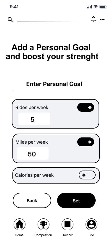
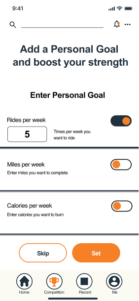
All participants loved the option to enter the competition & add a personal goal
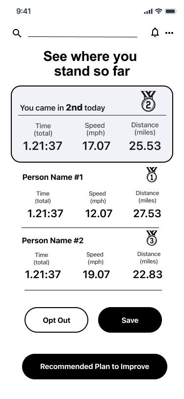
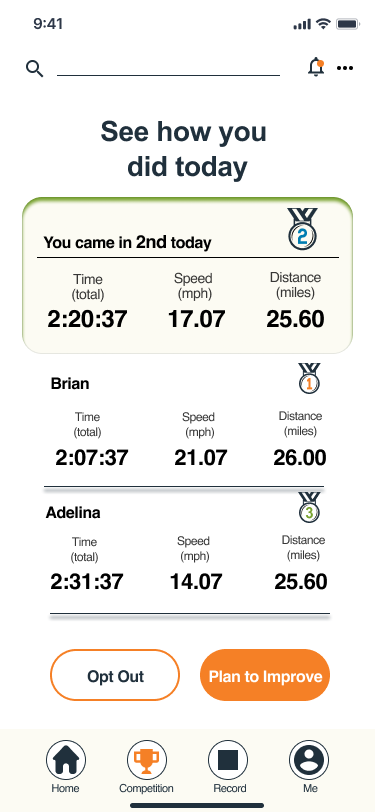
All participants would like to see the ranking, earn badges and prizes
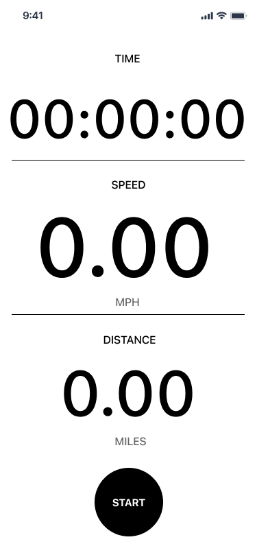
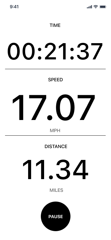
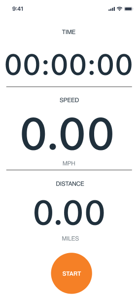
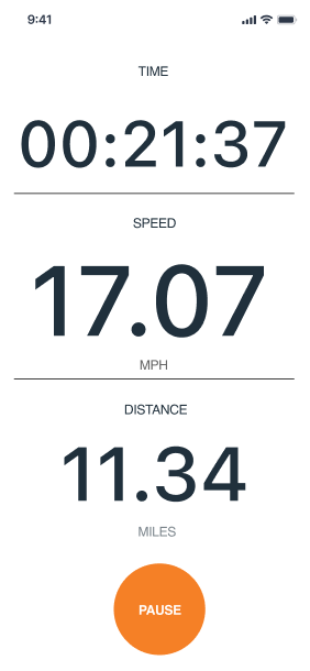
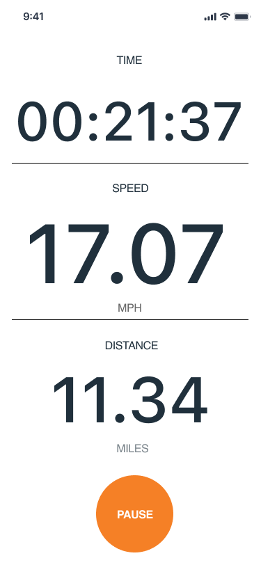
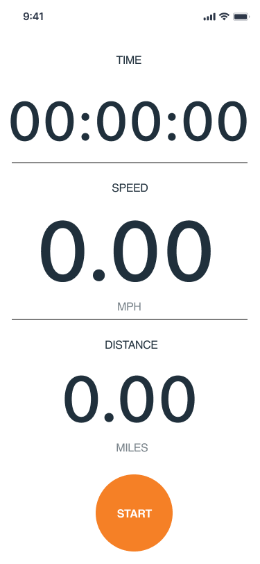
All participants want to see time, distance, and speed on the app screen during cycling
App participants mostly want to see, after completing the workout, how it compared to their previous one and their track for beating their personal goal
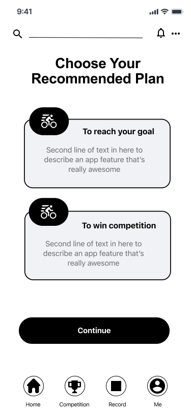
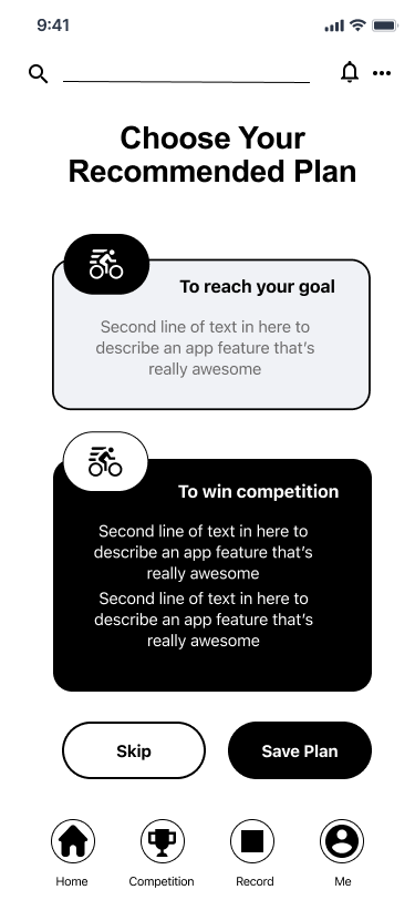
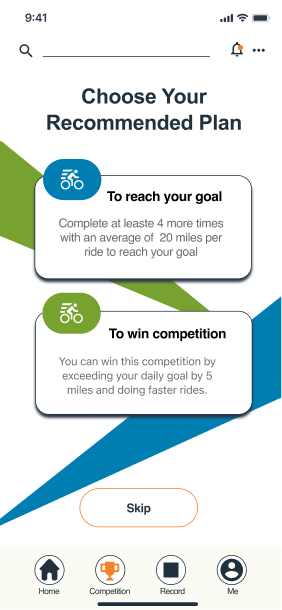
Most participants would like suggestion(s) plan or workout to improve/move up in the competition
All participants do not want to share progress on a social platform
Frustrations:
Most cycling applications do not offer a personalized goal plan
Current apps do not offer an opportunity for users to earn a bike
No guidance on learning essential knowledge and hands-on skills in bicycle care and maintenance available for users
Wants:
The users need to compare their personal performance
Customized prizes will increase users participation
The user wants to see the ranking status for personal motivation

User Persona
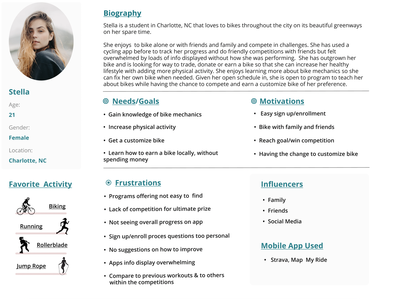
Based on the research gathered and my interview findings, I created Stella as my user persona. Representing my targeted audience motivations, frustrations, need, and goals during the completion of the task. Stella is not new to mobile app cycling but she is looking for some motivation and a way she could also avoid paying for a bike due to her student budget.
Site Map
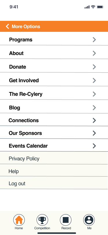
I took my ideas and concepts from user feedback and researched inspirations from similar and new products and structured them into a site map. This exercise was particularly helpful, as it allowed me to organize the content and features I would prioritize within the information hierarchy diagram on the home screen and all other screens.
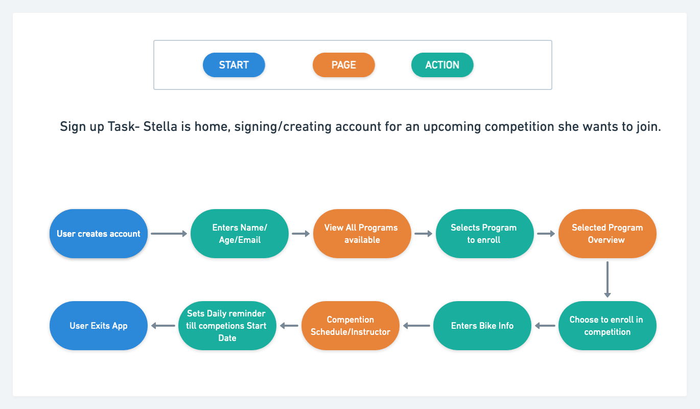
Task Flow- Sign Up
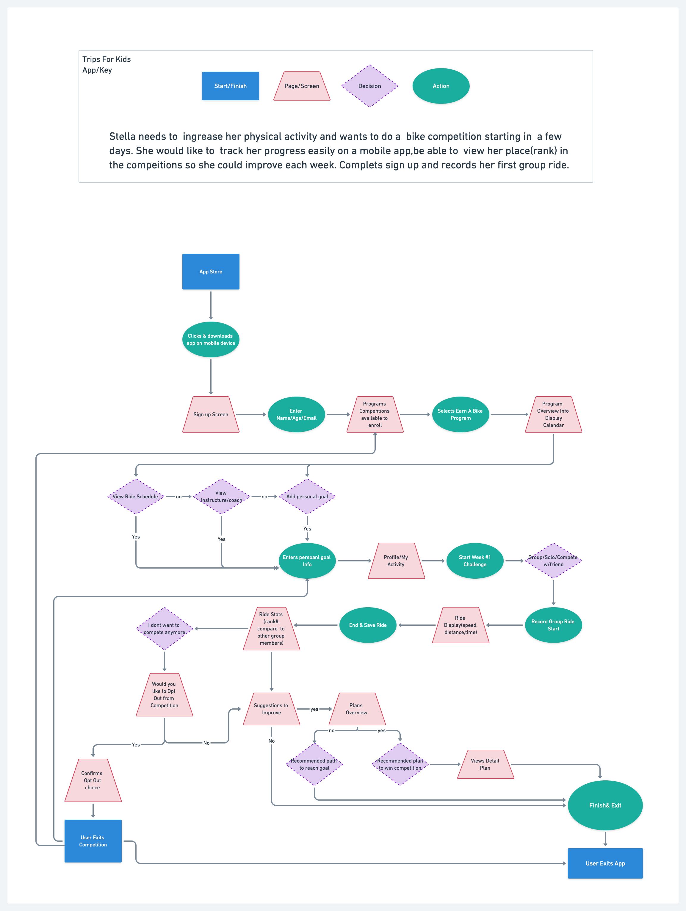
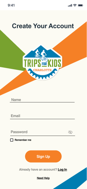
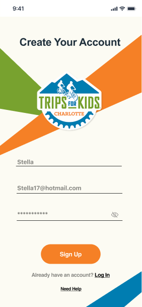
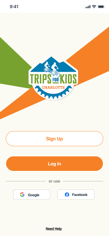
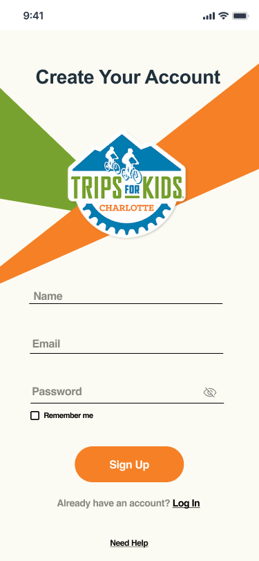
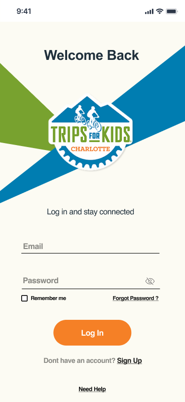
Using my Persona that represents the targeted audience for this app I designed two task flows. First, is the sign-up task, I used my research findings from competitive and market analysis to identify areas for improvement within the competitors' process and elaborated on providing solutions to user frustrations and needs.
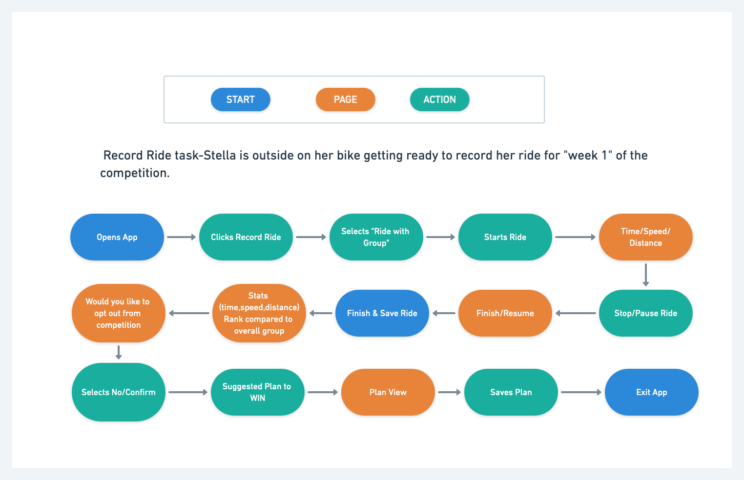
Task Flow- Record Bike Ride
In the second task flow, I also used my research findings from competitive and market analysis to identify areas for improvement within the competitors' process and elaborated on providing solutions to user frustrations and needs. During the motion period and after the completion period.
User Flow
To help me better understand a user’s journey through the platform, I created a user flow using my persona and feedback, that outlines the ways a user would be able to browse programs, record a bike ride, and chose a plan to improve performance. I realized that it was important to differentiate if a user was familiar with cycling apps or if this was the first time they have been introduced to such an application because that can significantly impact how the user would accomplish each task.
Mid-Fidelity Wireframes
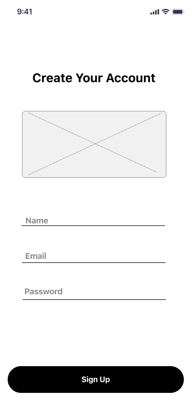
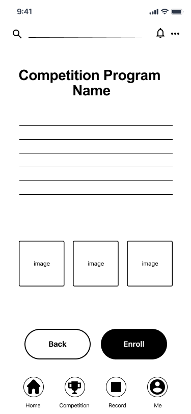
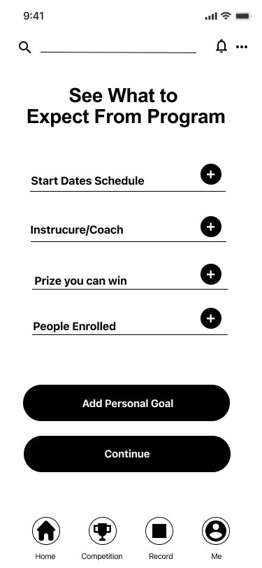
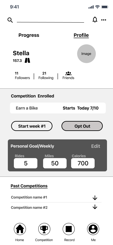
I designed the mid-fidelity wireframes to assemble how the information would be laid out on each screen. Using my combined research findings and persona to guide my design, ensuring the user needs were met before moving into the next phase of the process.

UI Kit
For the UI Kit, I chose to use the website color pallet and style, continuing to best match the organization's message to the audience. Displaying consistent representation of the product to ensure the delivery for the user’s best experience.
High Fidelity Prototype
Once I was able to clarify the information architecture and UI components, I began to fill in the graphic details missing in my mid-fidelity wireframes to visually represent the end product. I build a prototype in Figma, to validate complex interactions during usability testing to determine if the design would be aligned with users’ schemas and solved the problem identified during the Define phase. Focusing on the sign-up, competition, personal goal, and improvement plan screens and tasks.
Usability Testing
My Objective:
To understand the user’s journey from how the user arrived at the app to creating and completing a ride.
To understand the user’s navigation and functions throughout the competition and personal goal process
Successful navigation and completion of enrolling in competition and setting a personal goal
To observe and note any pain points, functions that caused frustration, confusion, abandoning the site, or inefficiencies the users encounter.
User rate at choosing to plan to improve
Key Findings:
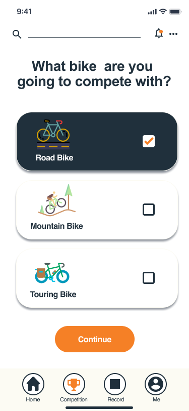
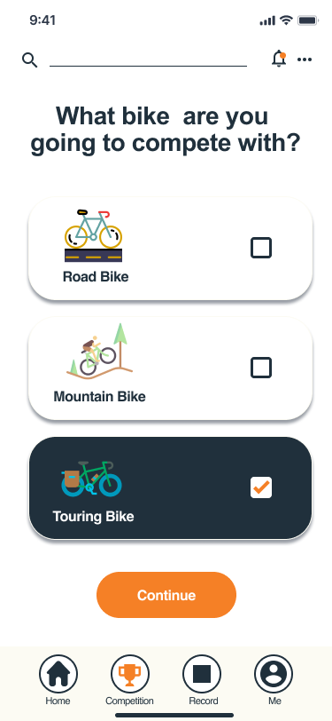
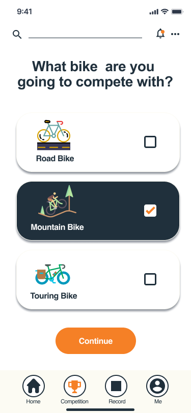
All participants had frustration and confusion on the “Choose a Bike” trying to figure out where to click and what the next function is. Thought more options would be nice to select.
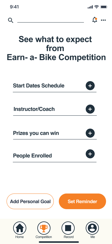
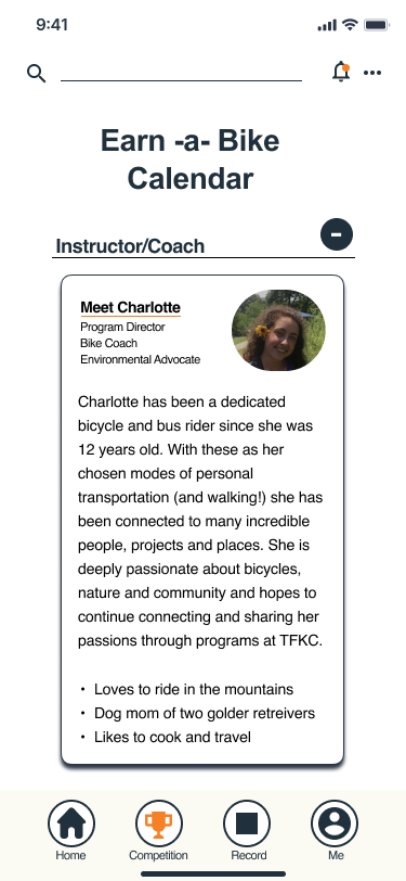
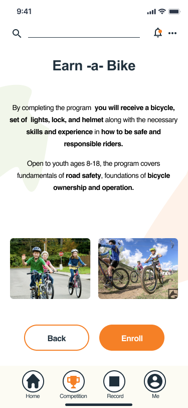
Most participants expressed a desire to see not only the calendar but the prize, coach, etc. on the program they selected, “What to Expect Screen”
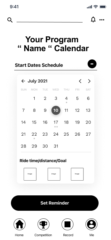
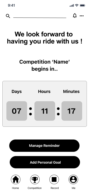
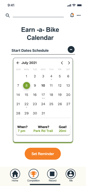
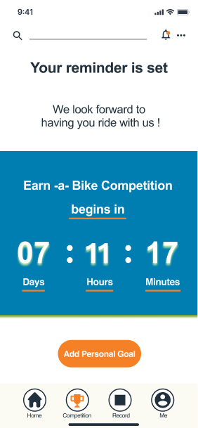
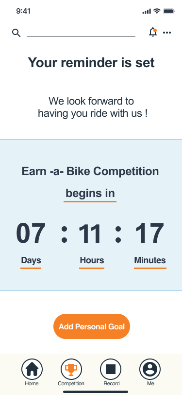
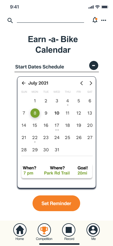
All participants had confusion on the “Countdown Calendar Screen,” not knowing where to go next and lead to abandoning the app. Also, screen overwhelming, color contrast made it hard to read, it was distracting, shadows created a strain on the eye, make simpler
Some participants experienced confusion on the “Duration Screen” during the bike ride, after the pause button was selected no clear instruction on where to go /click next to proceed.
Some participants were confused about the CTA buttons, the same button color was different on different screens, causing them to double guess where to click next.
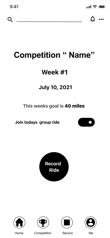
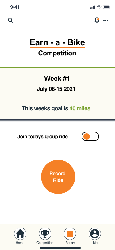
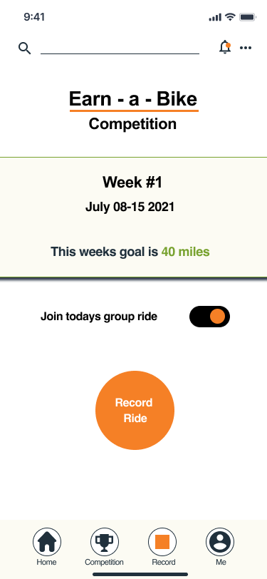
All participants were confused about the Record Ride, expressed the toggle questioned the action needed to be taken, not necessary and could be removed assuming the ride is joined already
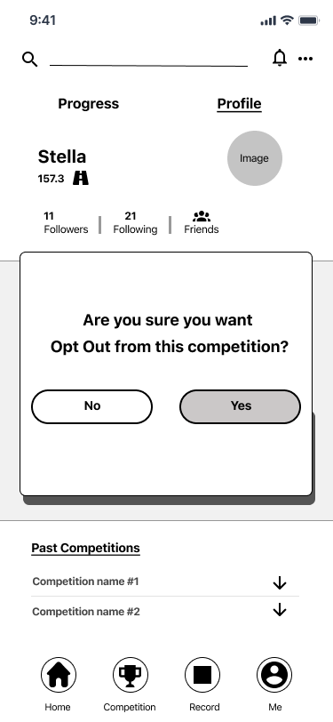
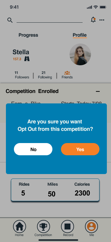
Some participants had trouble navigating through the Opt-Out Screen- not clear enough, cause confusion, and abandoned the app
Affinity Map
During the usability testing phase, the participants completed each task providing great feedback and indicated possible modifications of features and components that were unclear and confusing. Keeping that in mind, I was able to group user’s successes and difficulties they had during each task they had to complete and came up with solutions to resolve user’s frustrations and ease the process flow.
Key Changes, Additions and Improvements
I added more bike chose options for the user to choose from at the begging of the program because during the testing phase users showed a great amount of significance having more options was to them.
Added screens for “prize you can win “ and “coach” for each competition program. Users pointed out that viewing the coach information provides them with reassurance and confidence
Simplified calendar and countdown clock, removing distracting colors and making the visual layout of the screen easier on the user's eye.
Made toggle optional, users expressed the confusion of having to join the group ride and not being able to skip it
Made all the CTA’s buttons bigger, allowing the user to easily and quickly view while in motion
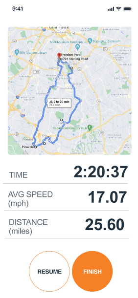
Also added map image of the route when the task is finished before the user decided to save the ride. This allows the user to visually see the path they have completed with each mile marked, and their current location.
I added a screen showing the stats before the user chooses to save their bike ride, giving the user a feel of personal satisfaction or completion
Made Opt-Out screen clearer and easy to view
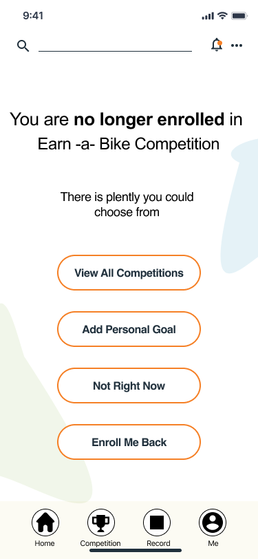
Added screen after Opt-Out decision to include for human error and giving user options to choose a different task. Giving users options that meet their wants and intrigue their interests with further exploration of the product
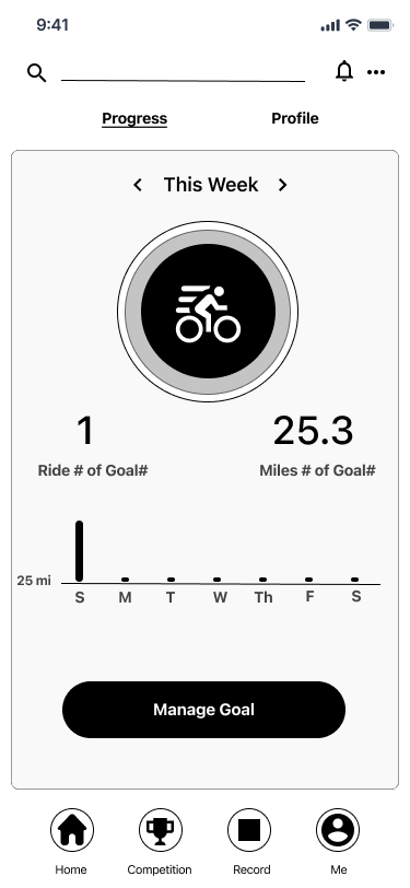
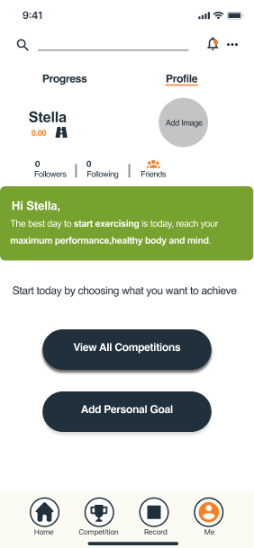
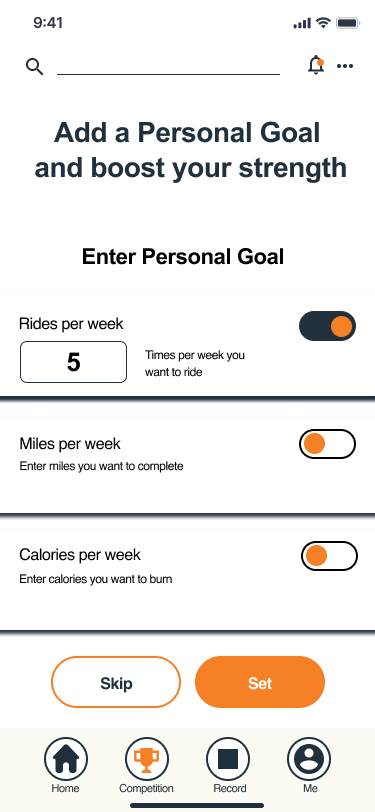
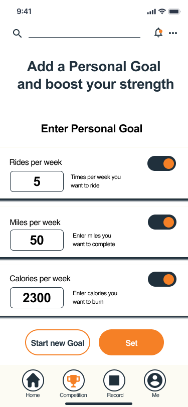
Added Profile view of users enrollment and personal goal
Final Prototype
With the revisions and implementations completed, I finalized the Trips for Kids Final Prototype in Figma.
You can view the prototype by clicking the button under, or scrolling to the top or bottom of this page.
Final Thoughts
This was an exciting project for me because it allowed me to design with existing branding guidelines and challenged me to think outside of my experience. The main challenge was understanding what motivates the users and what they value most. To achieve this, I focused on the market and competitor’s research first, then concentrated on users’ feedback to implement their needs and eliminate their pain points.
What I learned is that users always come first and before any other research I need to get to know my audience and the environment they will be using the product. As a personal mountain bike enthusiast, I enjoyed the design process and subject topic. One thing I would have done differently would be to conduct more usability testing, especially personally interviewing users from the program to learn what is their intrinsic motivation. Given the time constrain on this project I couldn’t test the final product, but I am looking forward to observing the users using it in real life.
Next Steps:
Conduct further usability testing of the final prototype
Add augmented reality feature to the customize bike option
Introduce a way the users can communicate, chatbox, in the app and competition. Being able to send motivational messages, etc.
Modify personal goals based on the user’s preference, option to train for a certain goal such as improve stamina, bike riding techniques, consistency, interval training.


