Youth Bloc
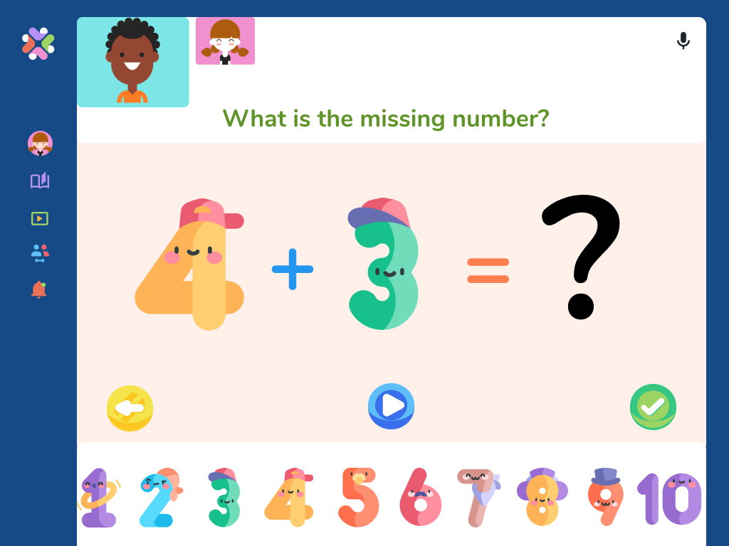
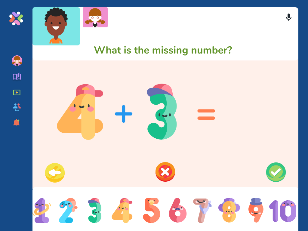
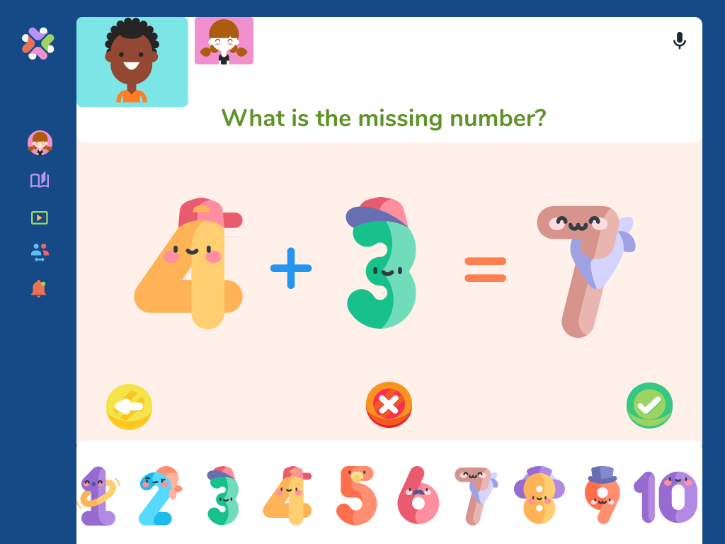
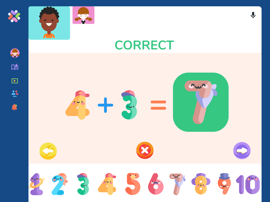
A responsive application that allows your children to stay connected with their friends in a digital environment with play-based learning games supporting the development of their healthy social and emotional habits. It is a safe and secure platform where younger children can explore and learn.
My Role
UX/UI Design, UX Researcher, Prototyping, Usability Testing
Project duration
80 Hours
July 30th -August 17th
Tools Used
Figma, Miro, Google Forms, Whimsical, Canva,Maze, Slack
Project Overview
Background
Across the world, children and parents experienced the most difficult times of their lives with COVID. For children, shifting classroom to online learning and playgrounds to backyards, it became daunting for them when they couldn’t see to play with their friends. With limited virtual activities options, the parents found it difficult to adapt to being the entertainer for their children.
Challenge
Designing a responsive web that will understand the pain points parents are experiencing, take into consideration the children’s interest in activities and solve the problem by allowing the parents to connect their children to play-based learning activities of their choice:
Combine learning and socializing to stimulate social development and education
Kids associate learning with something they have to do, not something fun they get to do
Attract more children to learn- through -play platforms
Make it safe, reliable and eliminate digital harm
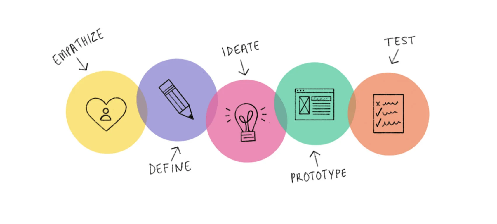
Design Process
Empathize
🌟 Competitor Analysis 🌟 Market & Secondary Research
🌟 User Interviews
Research Overview
Understanding the audience
I have limited knowledge of how children are adapting to the new virtual world, but I know that it was not easy for neither the parents nor children. To gain further insight into the challenge I conducted exploratory research. My main goals included understanding how playing games with friends virtually stimulates the user-child in further educational games, and identify the imperative concern the user-parent is experiencing.
Research Goal
Understand the parent's pain point, concerns, needs & goals for their child.
Understand what users want most from the application.
Identify what will encourage users to join/play.
Discover if playing games with friends virtually will stimulate the user in further educational games.
Determine if learning through a game played with friends is more enjoyable.
What will the incentive be for users to use this application?
Determine how often the user is likely to participate in play-based learning games with friends.
Competitive and Market Analysis
I began by researching similar learning websites to get a deeper conclusion of the current market, gain further knowledge of things to improve and implement that will provide the users with easier, simpler, and enjoyable options. My research is based on observations, secondary research, and a look into digital learning platforms.
User Interviews
The survey was a key to understand the users, what they looking for, and areas that they felt uncomfortable with before I outlined my design process. I focused my questions on the parents as they are the primary audience, the surveys were assigned to 3 parents, ages 33-40.
The Goal:
Define the target audience
Understand the parent's pain point, concerns, needs & goals for their child.
Determine the average time users spend on screen time daily
Understand the importance of playing with friends for the user
Identify what will encourage users to join/play..
Key Findings :
Parents concern is mostly with safety, they would like to have options to view child's activity and monitor it
Children expressed the importance to them to see and play with their friends is a something they look forward to
Children like to have a sense of independence, need trust
Seeing progress from both child and parent is important, gives simulations and motivation
Children are more likely to play a learning game if they play it with a friend.
Likes to learn new skills and have options to be in control
Frustrations
Most learning applications are for children in school, with very few options for younger kids ages 6 and under.
Games on the apps come with long instructions making it hard for young children to understand. No option to hear or visually preview instructions.
Applications do not have a dashboard view available for the child to see their progress, which takes away the feeling of independence.
Wants
Competitive games are imperative for children’s social skill development.
Children use playing games as a way to express and discover themselves, they learn about the world around them by interacting with other children.
Parents are coming to terms with the fact that technology is a part of today’s world and are looking for educational ways their children could use it.
Define
🌟 User Persona
🌟 Empathy Map
User Persona
Using the combination of user interviews and earlier research I was able to create Valentina as my parent-persona, to represent my user's goal, needs, and frustrations within the learning online and staying connected with friends. I kept this as a guide in mind while designing for the group of users it represents.
Key Takeaways:
Needs
Enjoyable way motivating children to learn
Share and explore different interest
Easy parent control set up the navigation
Child to keep in touch with friends
Safe and secure platfor
Pain Points
Not able to play with friends
Limited security and monitor options
Lack of new content updated regularly
Most game apps only offer solo games
Mindless screen time
Empathy Map- Child
To understand the users' behaviors and attitudes on a deeper level, I used my synthesized research observations to created this map of the child Mimi, giving an overview of how the users think and feel in their current environment. Using the visual I was able to empathize with the users' feelings making me look at the issue through their eyes.
Insights
Users felt isolated, miss their friends
Users anticipate the ‘get off’ command from the parent
Users wanted to trust and independence from parent
Users were more excited to play with friends regardless of the game
Needs
User needs to have social time
Users need a safe place where they are allowed to use alone
Users need the motivation to learn and be productive
Users need interesting content to keep engaged
Empathy Map- Parent
Following the same process above, I created the parent map, Valentina, to gain a deeper insight into the user's current thoughts and actions. Which helped me understand and prioritize the user's needs by clarifying the problems needed to be solved, and how.
Insights
Users felt screen time was a waste of time
Users hoped for a safe and secure application
Users hope to establish ways to use online activities to cultivate their child’s development
Needs
User needs to easily monitor child’s activity
Users need to diminish the feeling of guilt
Users need activities to inspire knowledge and encourage motivation
Ideate
🌟 Site Map 🌟Task Flow
🌟 User Flow 🌟Mid Fidelity Wireframes
Site Map
I created this map using my previous research findings and categorized the information in a hierarchy diagram with content for MVP to show how the application information will be prioritized. I devoted some time to think about the goals this product needed to accomplish, and the features it needed to overcome the obstacles users were facing.
After some iterations of the map, I found it would be helpful to meet the users' needs by including an onboarding process screen before using the application. I also included a mobile version of the navigation bar to visualize how the content hierarchy will be categorized.
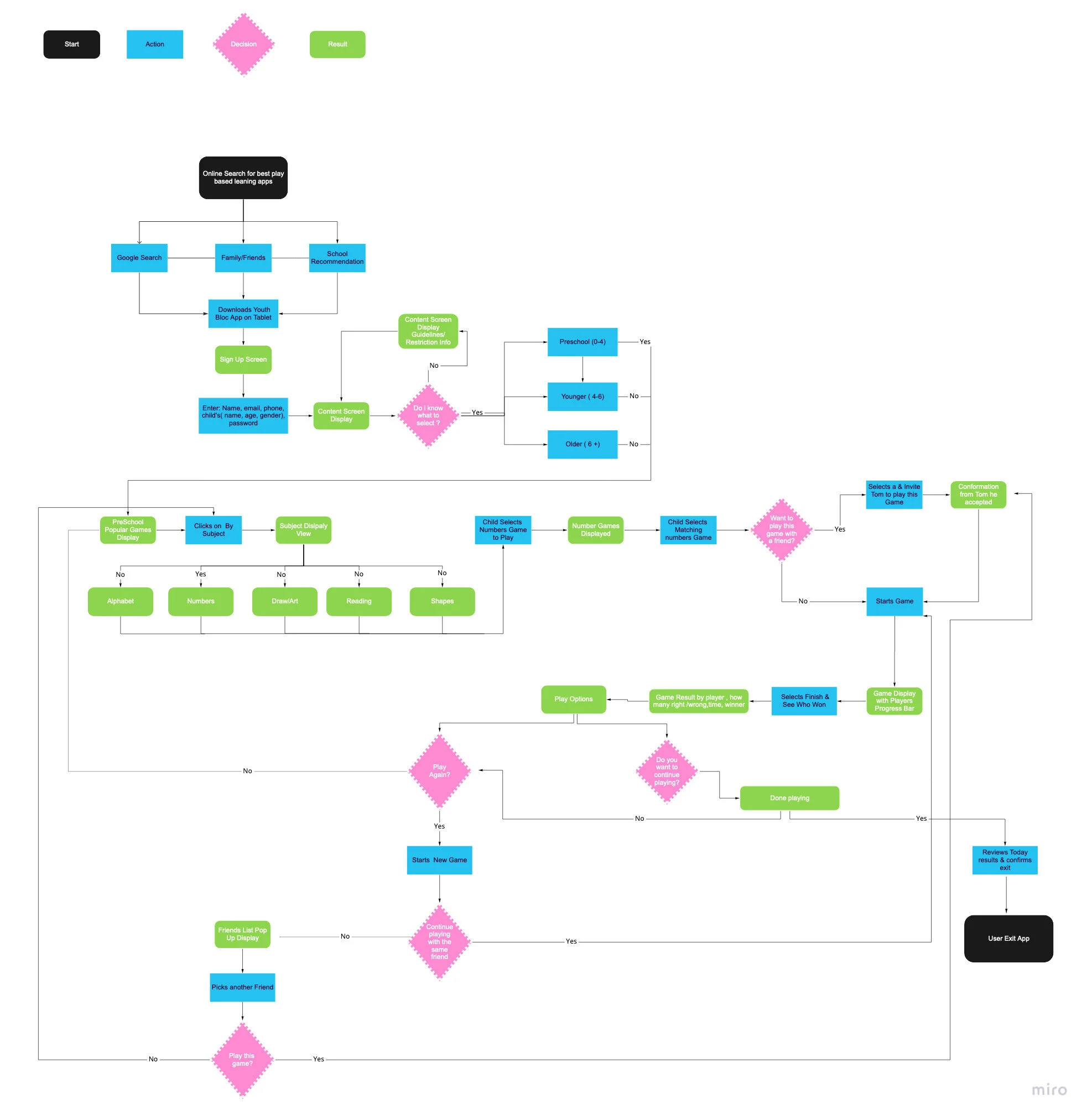
User Flow
Keeping the empathy map and user persona in mind, I created the user flow along with defining the site map above to help me understand each scenario a user may face while navigating the application. Carefully choosing how to display content to define the most important screens and features a user will need to complete the desired task from beginning to end.
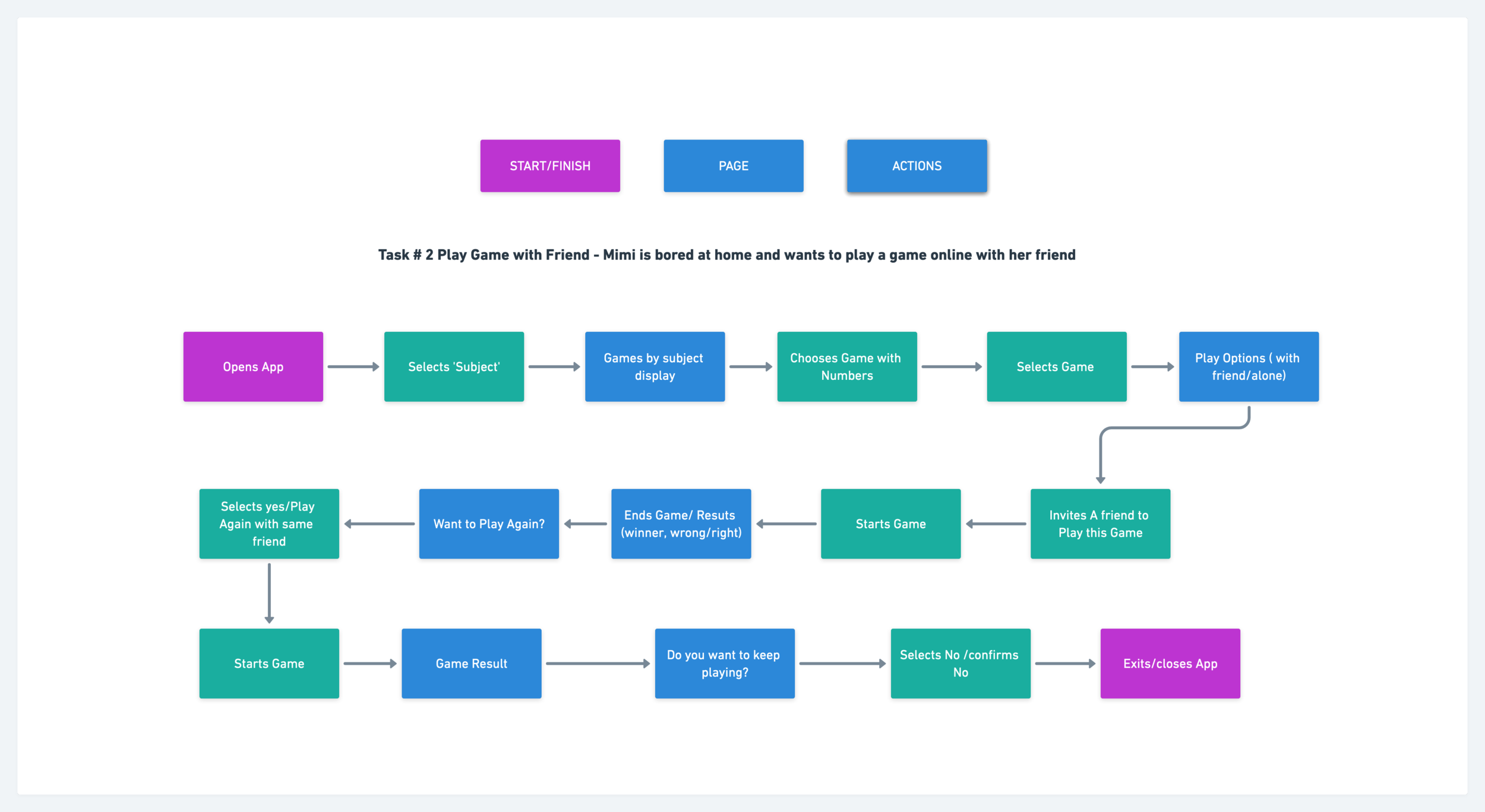
Task Flow #1
This task represents the key functions and necessary steps a user needs to follow to complete the main task, which is to search by subject, select a game of choice, then video calls a friend to play it with. Following this, I will be able to choose the key screens that will be part of the product design wireframing
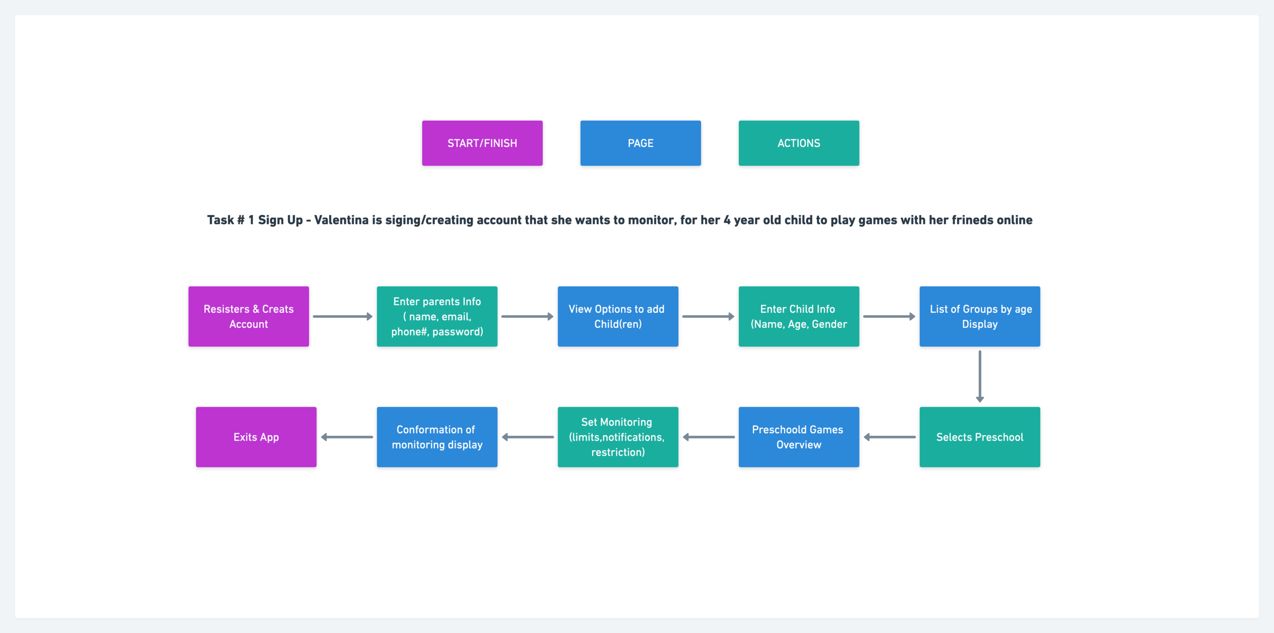
Task Flow #2
Same as the first task, this task will represent the key functions and necessary steps a user needs to follow to complete the secondary of signing up your child for the app with demographics and setting motorizing options. Choosing the key screens that will be part of the product design wireframing after simplifying the process.
Mid Fidelity Wireframes
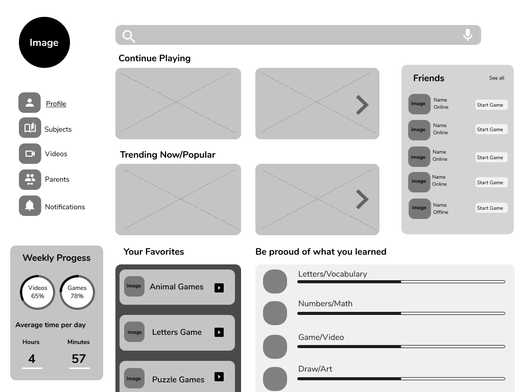
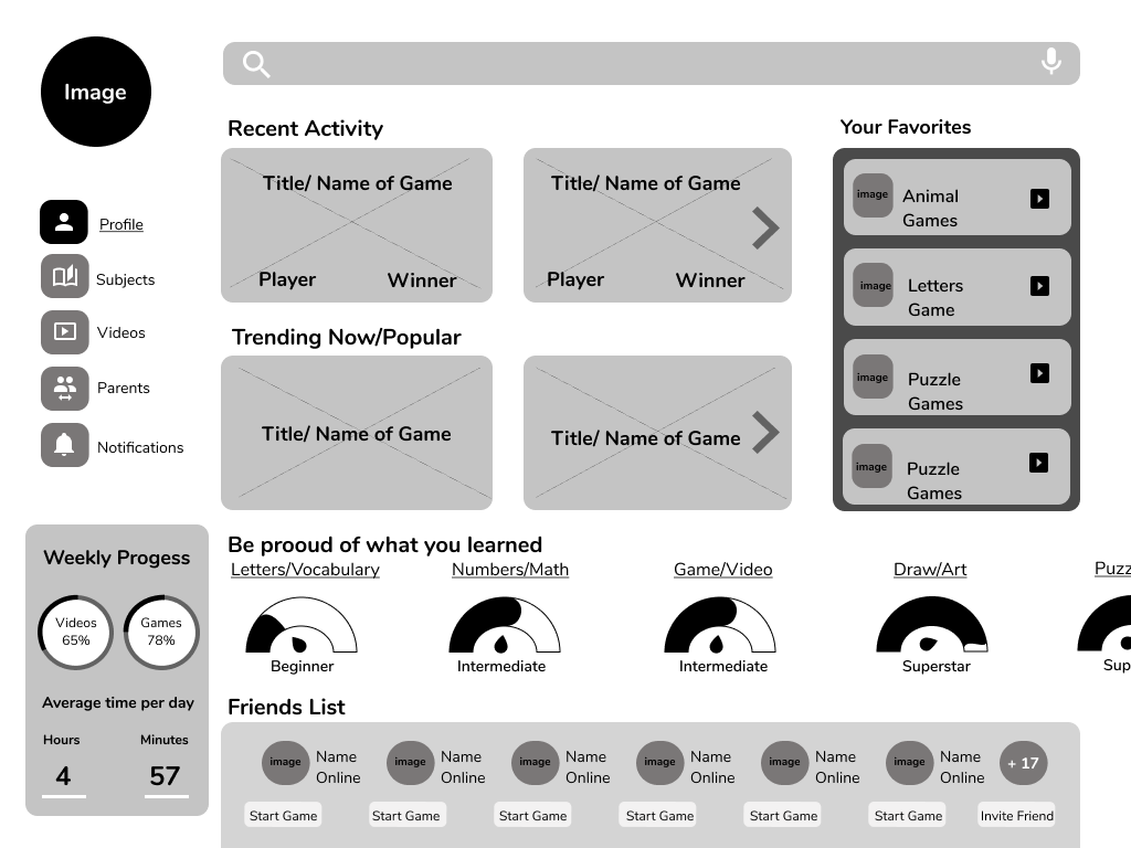
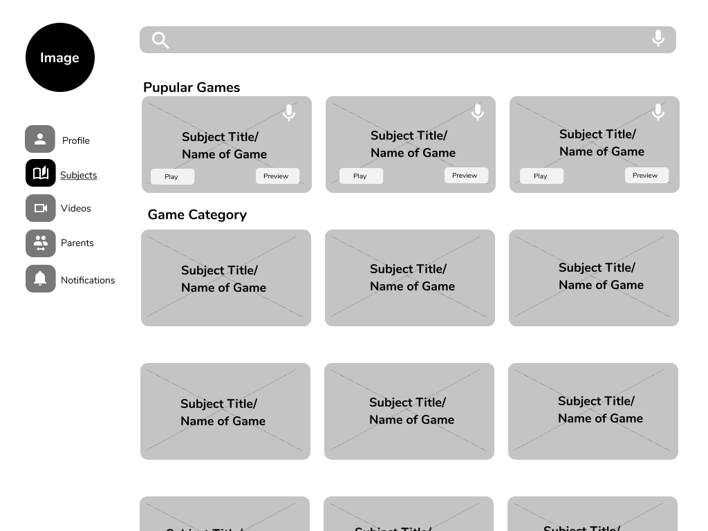
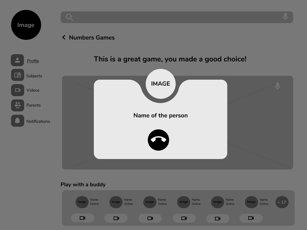
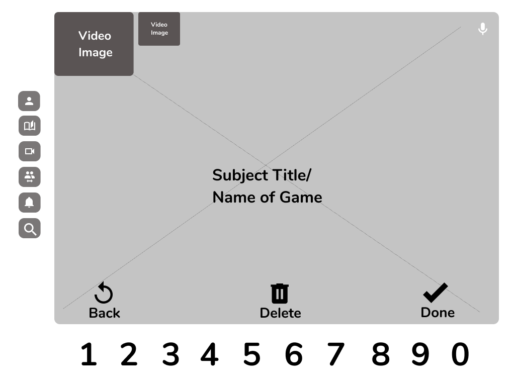
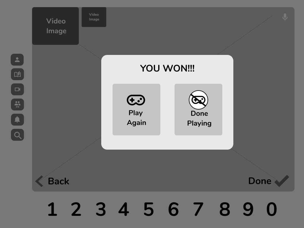
I designed the pages based on the research and brand design. An app of this nature is content-heavy and it can easily become overwhelming to the user, therefore the design had to be simple and comprehensive. During the Empathize phase, I was able to identify patterns in similar apps that worked for users but most importantly I discovered some that didn’t.
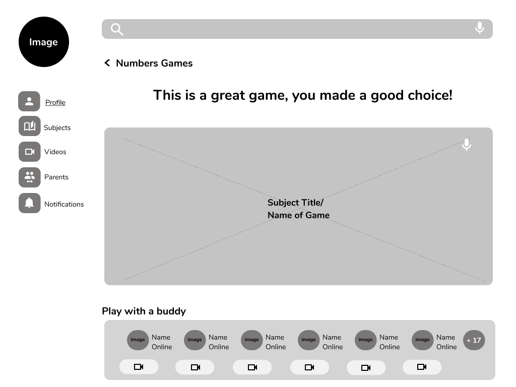
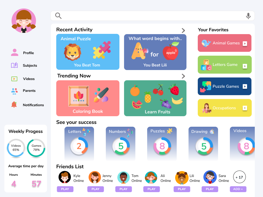
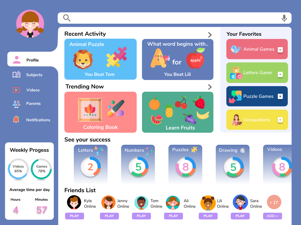
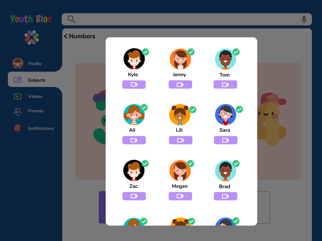
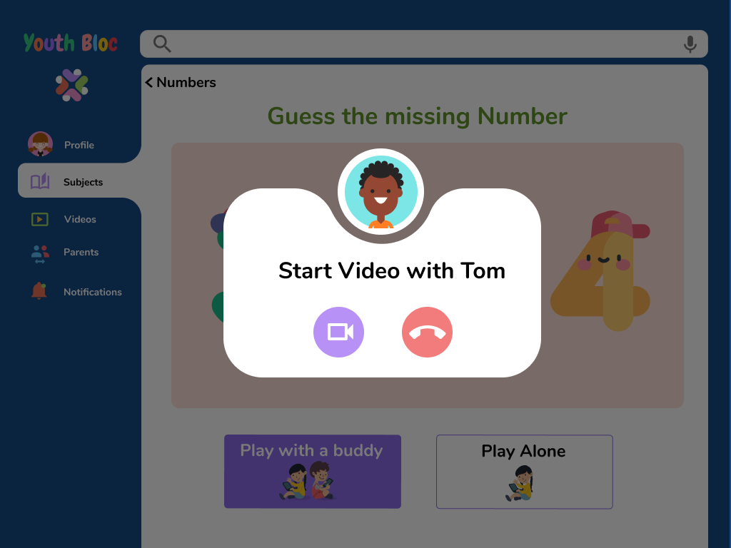
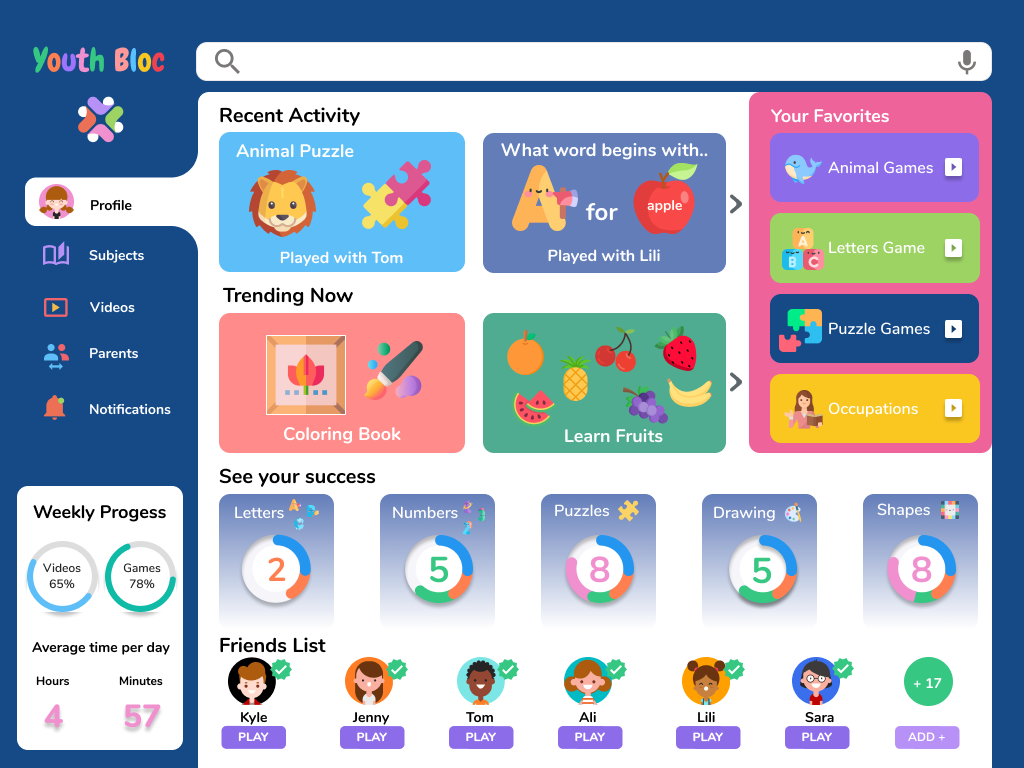
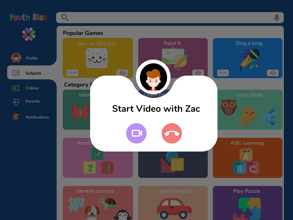
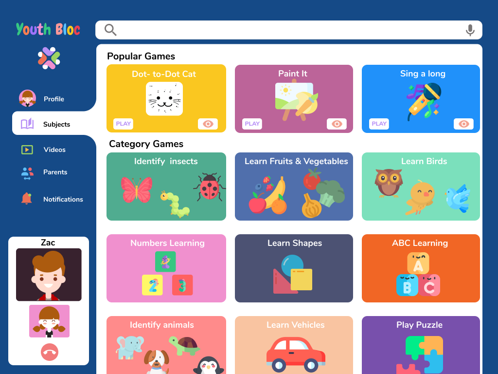
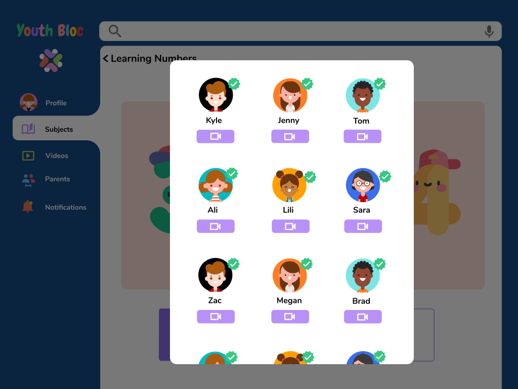
I designed each screen intending to resolve the frustrating patterns, one of them being to viewing the mass amount of information without being overwhelmed, and another of a dashboard allowing views to see progress easily. Lastly, the users stressed the importance of staying connected and being able to video play with friends, thusly I included a feature for users to video call anyone from their friends' list
Prototype
🌟 UI Kit 🌟 High Fidelity Wireframes
🌟 Prototype
UI Kit
For the UI Kit, I chose to use colors that are fun, playful and will attract the child’s attention. I incorporated that into the branding and used it as guidance when creating the logo. After completing the competitor research made a color palette and selected style to create a playground visual representation.
Branding Identity
I created the identity of this product by starting with a different style of logos, keeping the theme with a bright color palette that children find most appealing based on my research. After narrowing down my ideas I decided to make the representation of the bran with language communication that is easy, clear, and simple to understand, followed by inviting and fun content.
I chose for users to be shown as avatars for safety and security reasons, as it was the most important from the parents' point of view. Allowing children to choose and modify avatars yet not exposing their selves to the digital world.
LOGO
While creating and sketching out the logo I wanted it to represent the product as what is expected to be, fun, colorful, trustworthy, simple, and elegant. A symbol of kids playing together in a safe environment. That is where the idea of a 3d block came, to represent the brand and I also wanted the logo to show abstractly, kids playing together in a circle and that is when I decided to finalize my logo by using all of the palette colors to outline the children within the logo design.
High Fidelity Wireframes
Using my mid-fidelity wireframes, I create the high fidelity wireframes and prototype to exemplify how I would aesthetically implement concepts within the app. After defining the information architecture and UI components, I filled in the graphic details missing in my mid-fidelity wireframes to visually represent the end product.
I realized it is essential and most beneficial to design the high fidelity wireframes before conducting usability testing because many concepts utilize images and text that will be better visualized on a high fidelity rather than mid-fidelity wireframes. Following my goal to make a responsive design, easy to use and interesting for young children. I explored different layouts with a dark and light version and decided to go with the darker version based on feedback and user preference.
High Fidelity Wireframes
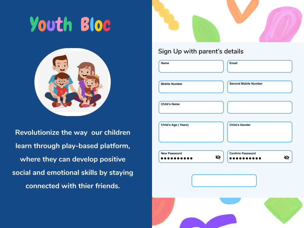
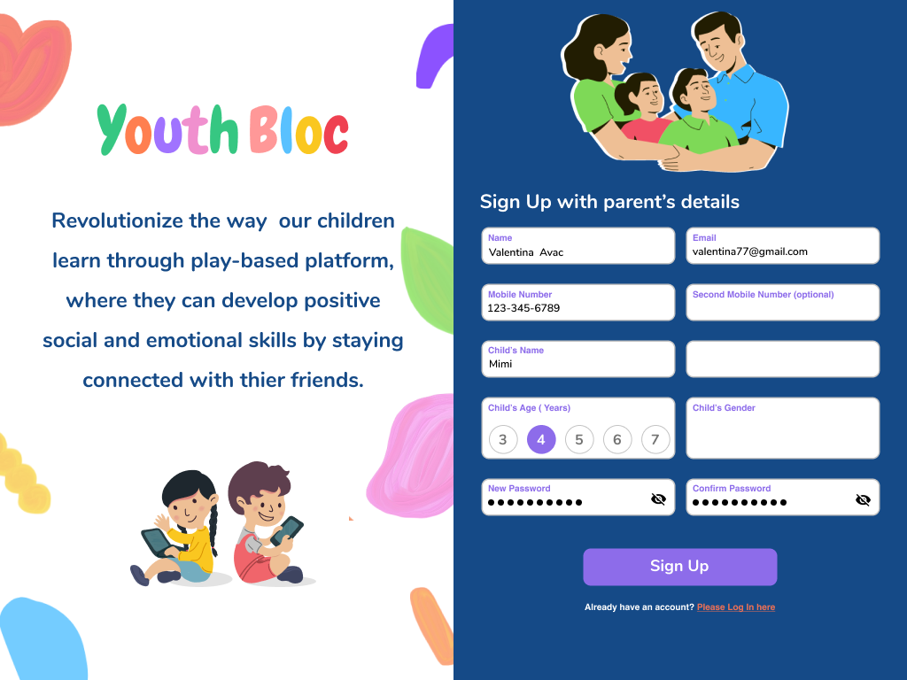
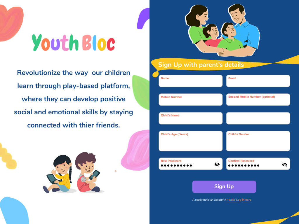
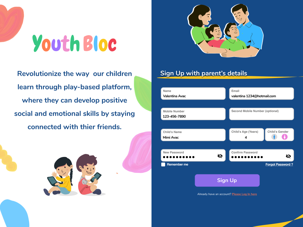
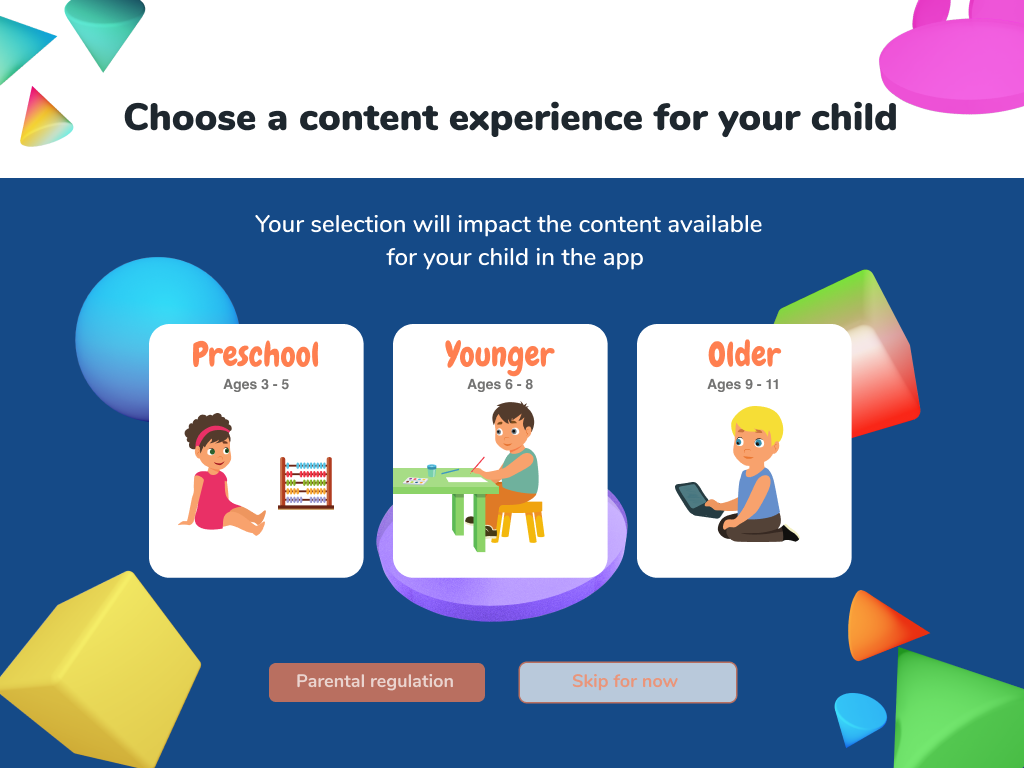
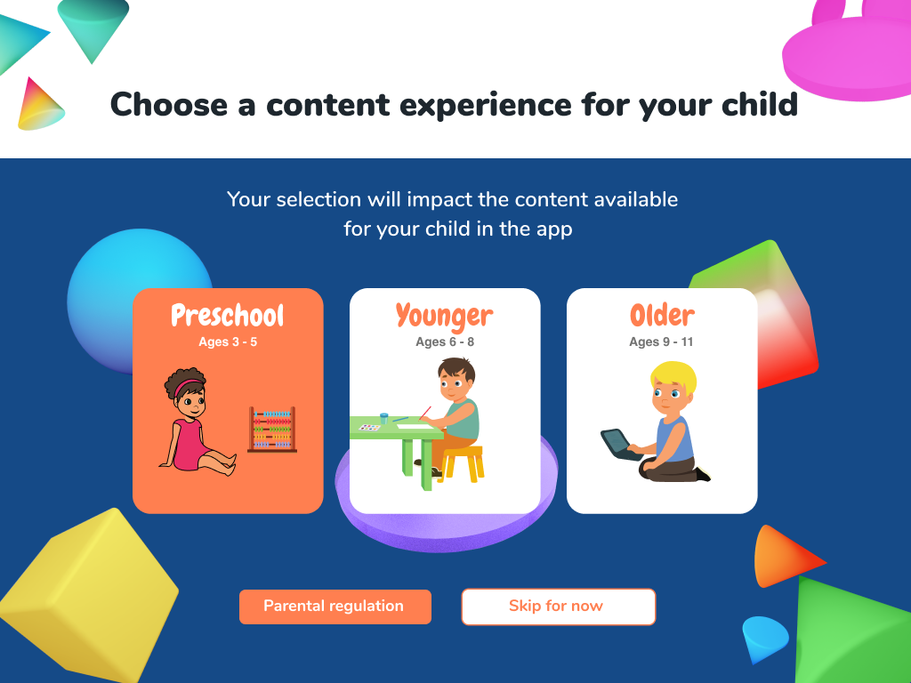
I created sign-up screens, exploring few different layout versions to determine the best visual layout display when the parent initially downloads the applications and creates an account for their child. I kept in mind the concern each parent had in regards to accuracy, security, and safety.
Prototype
Using my high-fidelity completed wireframes, UI elements, information architecture, and previous findings, I build a prototype in Figma. Incorporating interactive states into each page, and wired each state to the corresponding page to establish complex interactions during the usability testing, observe the app’s functions and determine if the design aligned with users’ needs, and solved the problem identified in the Define phase.
Test & Implement
🌟 Usability Testing 🌟 Affinity Map
🌟 Iterate & Implement
Usability Testing
My Objectives
Find out what the users’ current habits and motivations are
Gain knowledge of users’ current selections and interest
Understand parents desires and needs
Gain an understanding of how playing with friends would affect a child’s desire to learn
Understand the user’s navigation & functions through the process from the dashboard in the activity
Successful navigation and completion of video calling & selecting a game to play with a friend
To observe and note any pain points, functions that caused frustration, confusion, abandoning the site, or inefficiencies the users encounter.
User rate at exploring other subjects and using the app regularly
It was great to see that all participants were successful in completing all the tasks. They enjoyed the playful layout and colors that guided them through each screen. All of them expressed the ease of navigating through each screen with a clear understanding of functions. They particularly liked the cheerful colors and fun experience.
Key Findings for Improvement:
• 95% of participants wanted more available options on the dashboard
• 85% of participants wanted to call a friend from the dashboard before selecting a game
• 97% of participants looked for back button on all screens, expressed confusing wording of the current back button
• 96% of participants expressed they would like to hear the instructions when they preview
Affinity Map
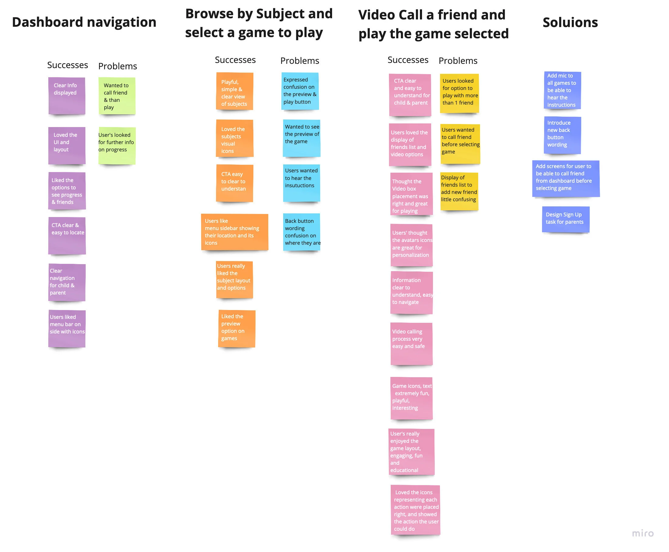
Through the usability test phase, participants completed each task easily and only mentioned few possible enhancements of features and components that were confusing. With that in mind, I came up with an affinity map that presents opportunities to improve my prototype.
To create my affinity map I used Miro because they have ready-to-use post-its that I can easily drag and edit. The map groups user’s successes and problems they experienced during each task they had to complete, and it shows the solutions I came up with of how to resolve user’s pain points.
Top Concerns
Not being able to hear the instructions
The user was confused about how to get back to the previous page, CTA was hard to locate and understand
Did not understand why they could not call friends before picking a game
Opportunities
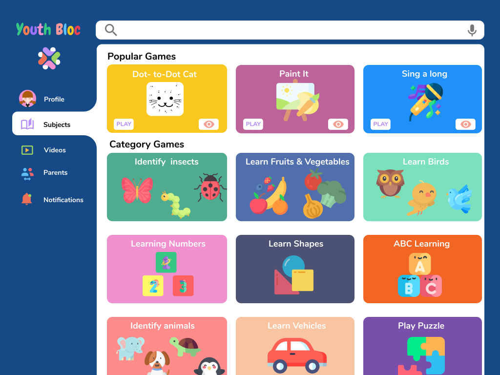
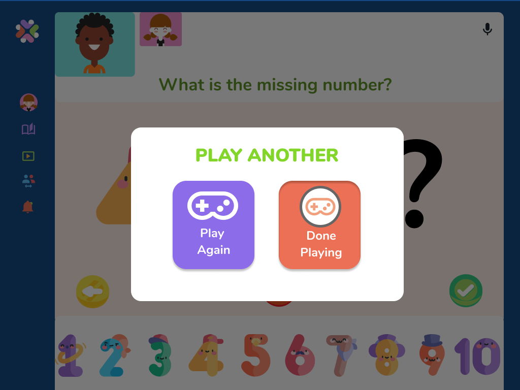
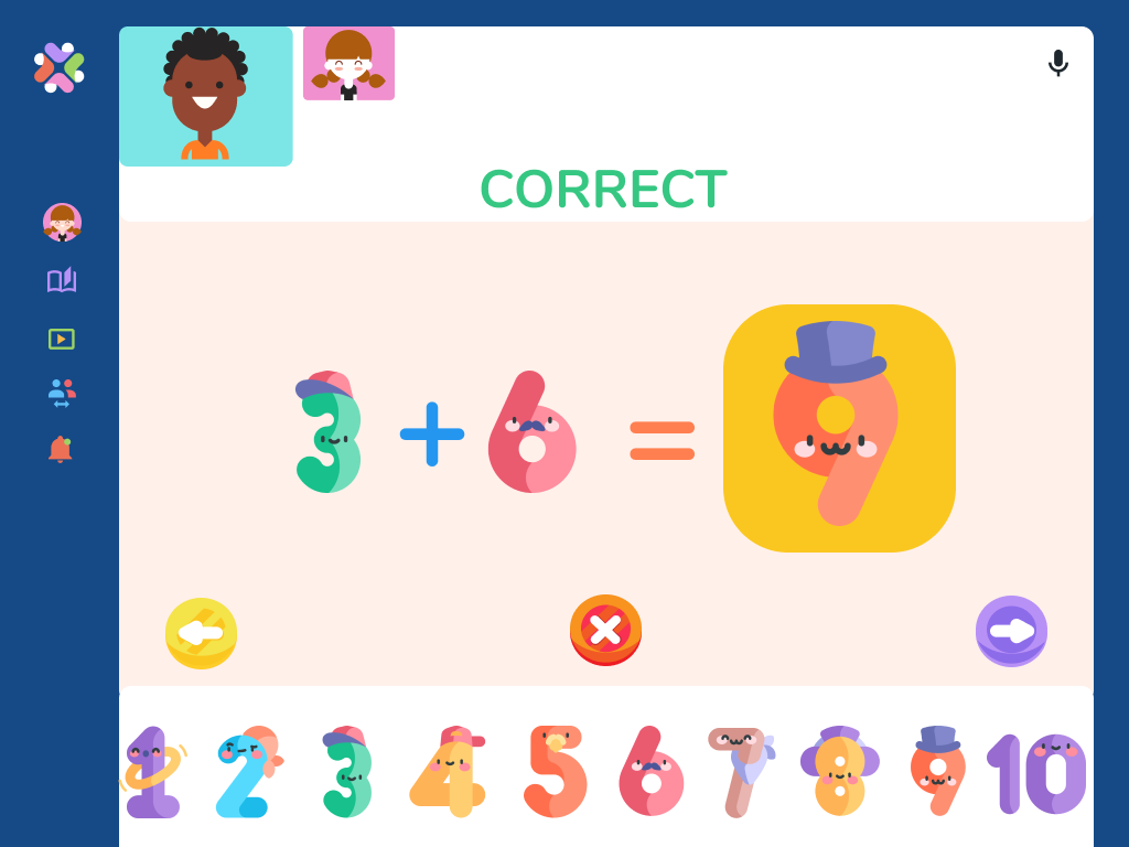
Added a mic icon to each page and game card along with a preview option
Changed the wording of the back button making it easy and understandable
Added options for the user to call a friend before selecting a game
Key Changes and Implementations
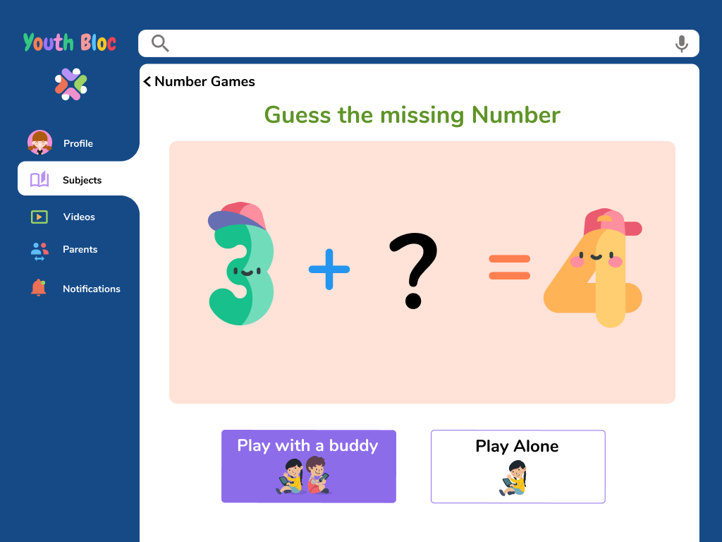
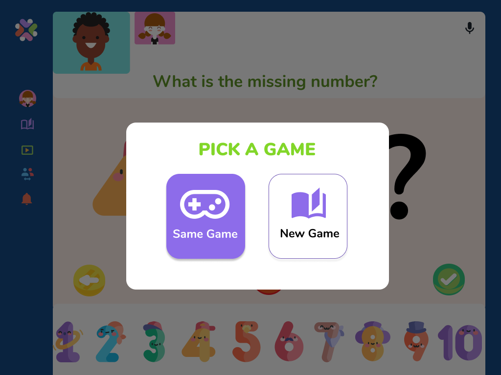
Added an option for the user to be able to call a friend from the dashboard first before selecting a game. This gave users the ability to collectively choose a game to play, helping them build skills such as listening to others, sharing, and taking turns.
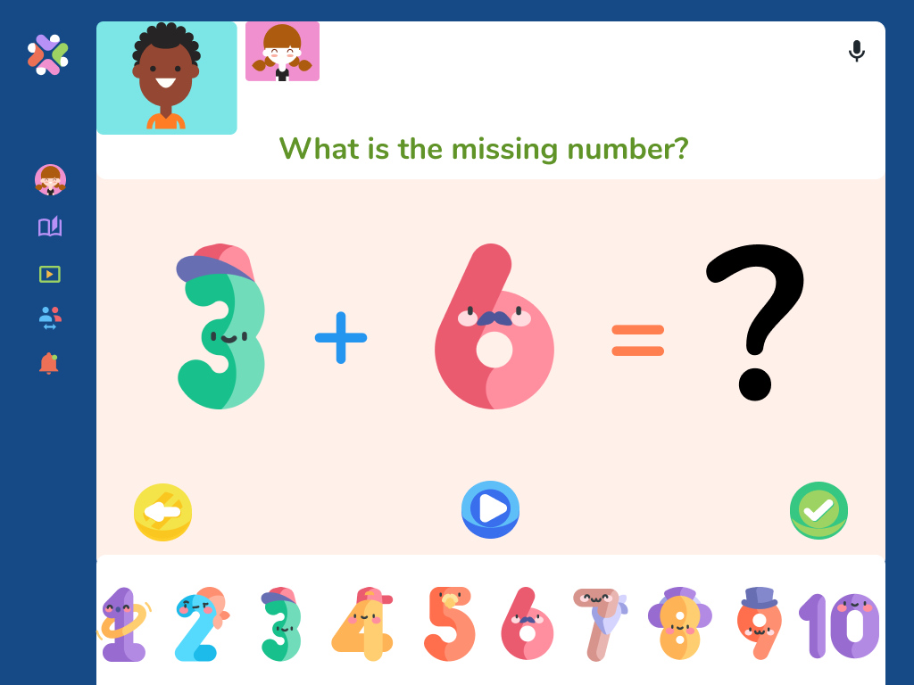
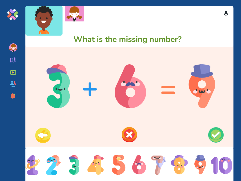
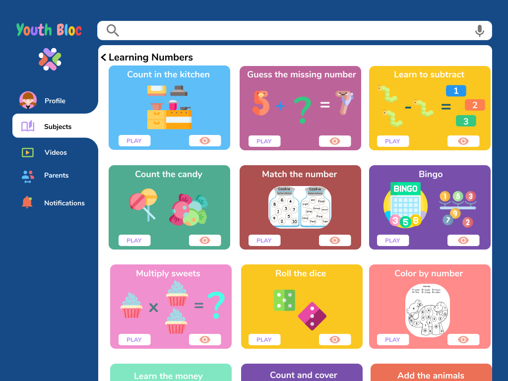
I also added a mic to each subject card and current game to give the user the option to hear the instructions, this is particularly useful for younger children not being able to read yet but can learn by seeing.
Key Changes and Implementations
By changing the wording of the back button (crumbles), I eliminated the confusion users expressed with not know where their current action came from. I wanted to make each action visually clearer and easier to find where the user is and where they came from.
Final Prototype
With the revisions and implementations completed, I finalized the Youth Bloc Final Prototype in Figma.
You can view the prototype by clicking the button under, or scrolling to the top or bottom of this page.
Final Thoughts
This was a fun and creative project that I loved working on because it came from a personal experience. In the past year the world became remote, education was affected severely and with limited virtual activities options, kids became bored, parents became desperate for ways to keep them occupied & entertained. One of the challenges was identifying what key features would be necessary for the MVP. It was difficult to only include the bare minimum, but the most challenging one was designing a product that will give the children a fun, safe, and independent way to use the application.
Even though I couldn’t interview children, the parent’s feedback and usability testing results helped me outline my design plan. Giving prominence to my market and competitors' research, I was able to identify ways to design a product that focuses on implementing the users’ needs and resolving their frustrations. I wanted to begin this by interviewing the children to understand their motives and views, but with the given constraints on time and opportunity, it wasn’t possible. In this situation, it was extremely beneficial for me when I focused on creating user personas’ as it gave me the visual guidance to assimilate the targeted audience's needs and obstacles into the design product.


