Kaus Insurance
A responsive e-commerce website design with updated branding establishing the transformation of a trustworthy insurance company. Driven to expand its online B2C by promoting it’s products and focusing on attracting millennials to break the traditional image about insurance and feel confident when buying insurance on an e-commerce platform.
Role
UX Research, UX/UI Design, Branding, Prototyping, Usability Testing
Duration
80 Hours
June 12th - June 24th
Tools
Figma, Miro, Google Forms, Whimsical,Maze, Slack, Zoom
Project Overview
Challenge
Kaus is an established insurance company that has been selling insurance to customers through agents for years. With the rising of the digital world, more people are turning to online platforms to get insured, which is causing Kaus to lose the ground of attracting new customers and the young generation. Users are overwhelmed when choosing the right plan due to the complexity of multiple different products and it's complicated to understand information display.
Background
Kaus has been in business for over 30 years selling their insurance policies through regional agents instead of directly to their customers. They provide various types of insurance for each individual, health, motor, property, aviation liability, protection, life, and in the future ( business insurance). To keep their cost low and their efficiency high, they have over 350+ prepared packages the individual to choose from, with minimal room for customizing. They are looking for moving from B2B to B2C.
Design Process
Research
Objective
We want to know what are the important factors in a user’s decision when choosing an insurance policy so we can display that information clearly and easily to understand, helping users choose the best product for them.
Research Goals
Understand insurance competitors
Understand what users are looking for when buying insurance
Understand user’s motivations and behavior for buying insurance
Identify pain points & challenges of users purchasing insurance online
Gain insight into why users choose the current plan
Identify challenges of competitors insurance quote/purchase process
Competitive and Market Analysis
I started by researching popular insurance sites to get a grasp of the insurance process and gain further knowledge of what needs to improve and what works. Having worked in the insurance industry for several years, my research is based on the internet, subject-matter experts, and personal knowledge.
User Interviews
I conducted interviews with 3 participants ranging form 25-35 years old, with varying insurance knowledge and experience purchasing insurance online. All interviews were conducted by phone due COVID-19. The main key takeaways from the interview process revealed that:
Coverage and cost are the most important factor to a user.
Policies are pricey with limited coverage.
Most users find health care plans to be confusing with no clear information on coverage, and end up having to speak to an agent for further assistance (time-consuming).
All users prefer to easily compare policies online for price/coverage at a low cost.
Most frustration in users comes from not having a clear understanding of what deductible/co-insurance is, how it works.
24/7 Customer service is a major factor in providing assistance and guidance
Personal Development
Persona
Using the combination of user interviews and earlier research I was able to create Sarah as my persona, to represent my users' goals, needs, and frustrations in purchasing insurance online. I kept this as a guide while I was designing for the group of users Sarah represents.
Empathy Map
Ideation
Card Sorting
To understand the users' cognitive thinking process I conducted an open card sort exercise for participants to categorize 20 cards that correspond together. I found this to extremely helpful method because it showed common familiar group actions from users. Then, after analyzing the collected data and summarizing my results I was able to identify common themes, patterns, and categorizing that I will use in the building site map, user flows, task flows, and overall webpage information hierarchy.
Site Map
One of the major things that were reviled in the card sorting results was topics identified as the main page on the navigation bar. I organized the content and function findings into categories which I used for usability while designing mid-fidelity wireframes. It provided me with a visual layout of how the information will need to be structured, visualizing the sub-pages under each primary page allowing users to easily navigate through the site.
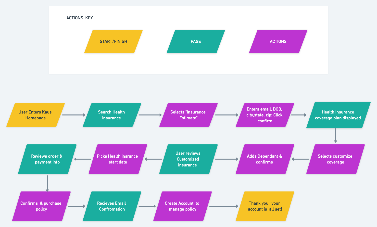
Task Flow
For me to visualize the navigation of the website from the user’s perspective, I created a task flow to understand the users' journey of completing the task of getting an insurance quote. This task represents the key functions, parts, and necessary steps that will need to be created within the website a user would use, allowing me to plan the pages that will best deliver an effortless interaction between the user and the product
User Flow
Keeping my personal in mind I created a task flow. Sara is in search of health insurance that is affordable and covers what she needs. Easy to purchase and manage. I focused on getting a quote easy and simple, this process would also help target younger users. For ultimate success, I studied competitor's quote processes to help solve existing user frustrations. I included the pages from Kaus website and mapped out every possible decision a user could face during the quote process.
Mid-Fidelity Wireframes
By focusing on creating responsive mid-fidelity wireframes, it was imperative to use my better understanding of the interaction between our users and the product. With keeping Sarah in mind, I focused on keeping the design easy, simple, and effortless in the process of purchasing insurance online.
UI Design
UI Kit
Kaus relayed that they wanted their brand to have a modern, fresh, and trustworthy feel. After completing market the research with competitors and discovering inspirations, I was on the pursuit to find a color pallet, typography, and illustrations that symbolized those words.
Branding Identity
LOGO- Kaus wanted their brand to represent fresh, trustworthy, modern, and simple style. I created a mood board with different styles of new logos, and after completing the market research I decided to keep things simple and design a watermark using the san-serif font.
High-Fidelity Wireframes
After defining the UI components and elements, it was time to combine my low-fidelity wireframes with the UI Kit. Using Figma, I created the high-fidelity wireframes visually representing key pages of the end product. Which I will use to build a prototype to validating interactions during the usability testing and notice if the design aligns with the users' mental process and solve the pointed out problems from my research. Holding on to my goal to make a responsive website that is easy to use and appealing to young customers, I hope I delivered a fresh, modern, and fun design.
High-Fidelity Wireframes
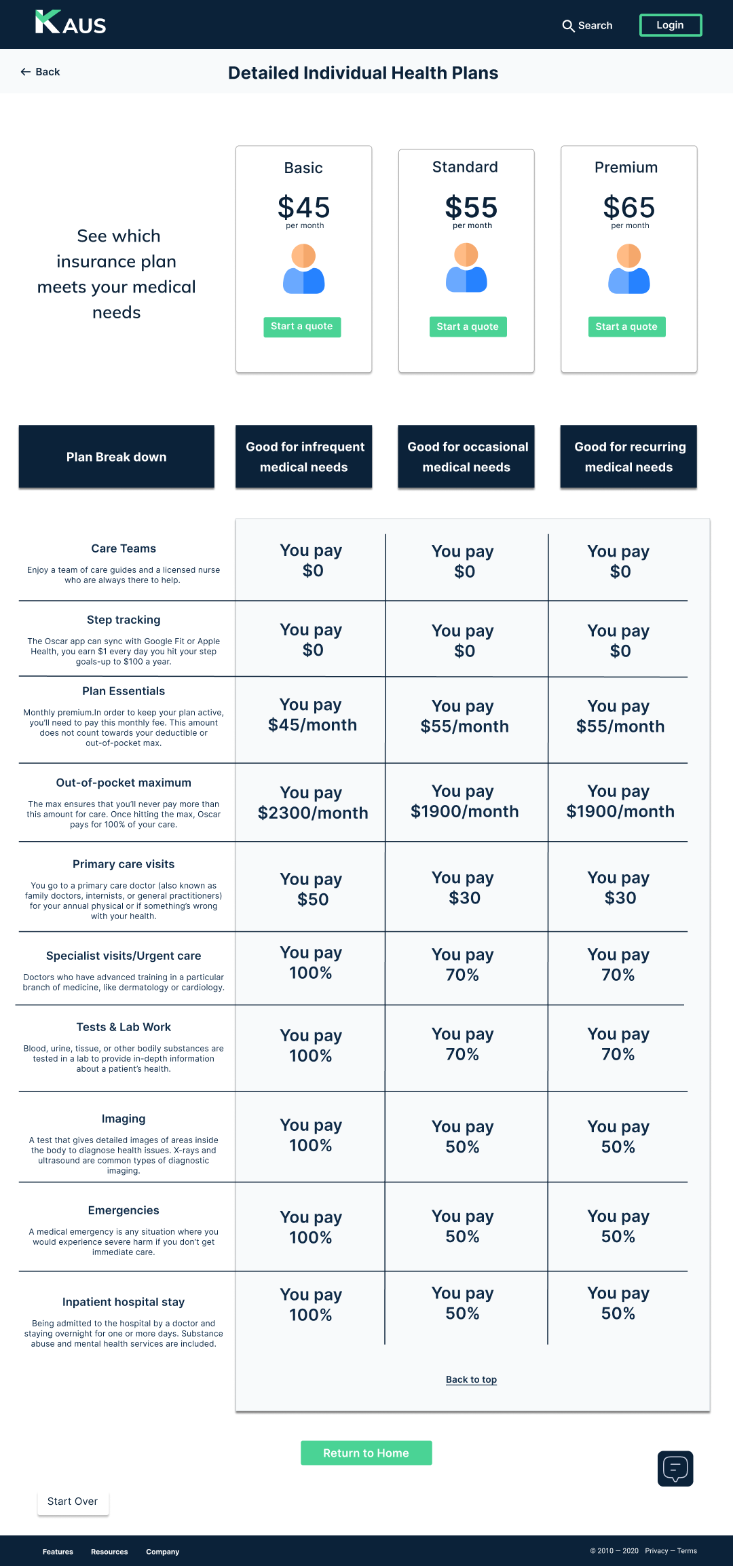
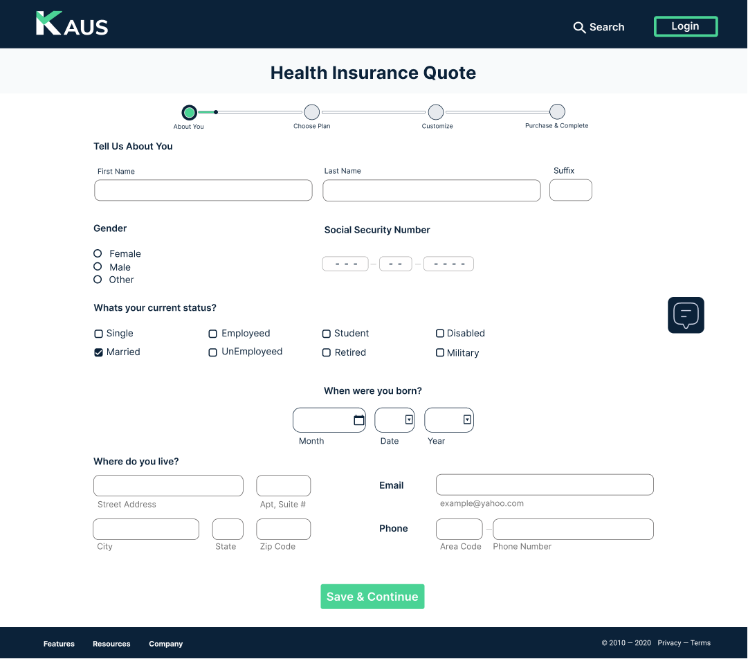
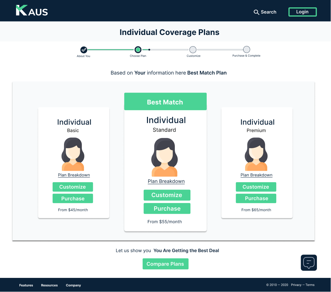
Quote Process:
I designed high-fidelity quote process screens from begging to end of getting a quote and completing the insurance purchasing. With option screens of creating an account after the purchase providing the user with a simple and quick way to view and manage their account.
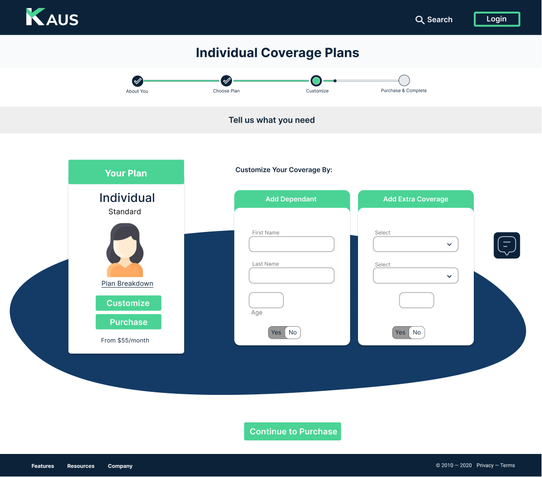
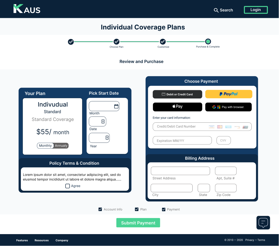
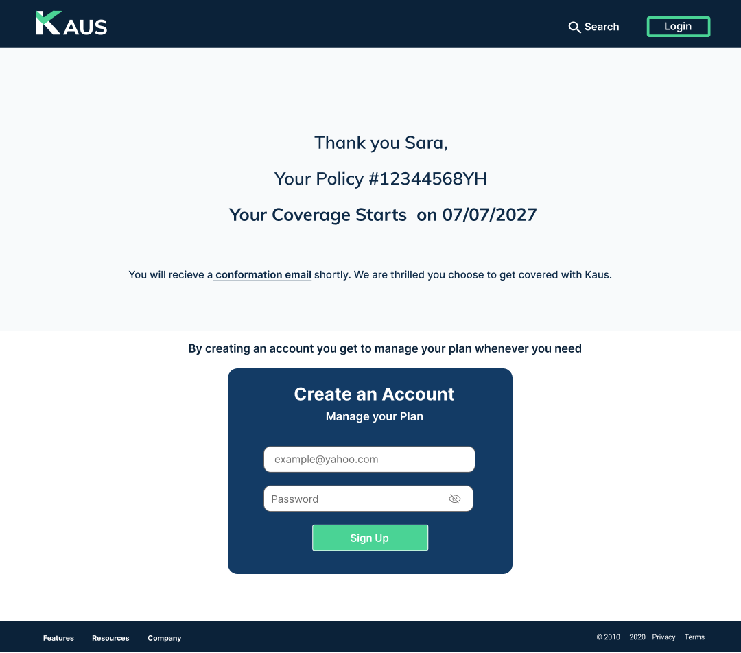
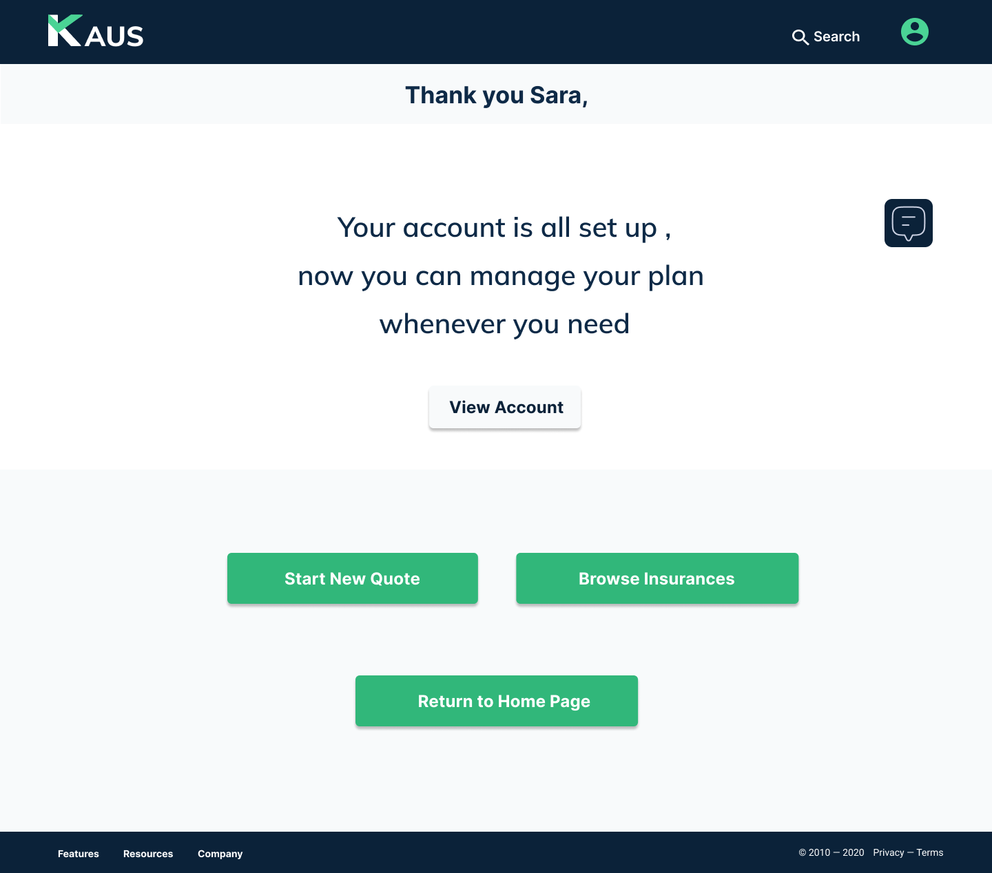
Prototype
This prototype is built a prototype to validating interactions during the usability testing and notice if the design aligns with the users' mental process and solve the pointed out problems from my research.
Usability Testing & Iterate
Using my high-fidelity prototype, I conducted usability testing with 3 participants. Each user was asked to complete the task of choosing an individual health insurance, getting a quote, and finalize their purchase. They were given the option to compare two plans, customize their plan and complete the purchase. With an option to create an account at the end of their purchase.
Objective
To understand the user’s journey from how the user arrived at the website to receiving and purchasing a quote.
Successful navigation and completion of quoted insurance plan.
Note any pain points, confusion, or inefficiencies the users' encounter.
User rate at creating an account when purchase completed.
Remote User testing
Key Findings
All participants had frustration and confusion on the payment screen trying to figure out where to click and what the next function is. Thought the calendar icon function was hard to find and not easy to see.
Almost all participants found it frustrating when they clicked on more details and nothing come up, wanted to see details of the plan without going through the comparison tab
All participants were confused about the back buttons that it did not take them back to the previous screen but to the homepage or nor the previous screen, start over button
All participants found the displayed information clear and simple to understand, with just the right amount for each of them to be confident to buy the insurance online regardless of their insurance knowledge level.
Affinity Map
Based on user testing, I created an affinity map to organized and sort user's feedback by displaying what they succeed in and what challenges they had while completing the task. This helped me come up with opportunities to improve and prioritize my final revisions on the prototype.
Revision & Implementations
I took the 3 high-priority challenges that all the users had during the process and revised them to reduce friction and increase customer satisfaction with their purchase.
Payment card screen re-designed to limit confusion & guide user to the next desired action.
Added a page with More Detail for each insurance, that can view once the ‘More Detail’ under each Insurance card is clicked, allowing the user a quick view and reduce going back and forth action.
Introduces Start Over button during the quote process allowing the user to start a new quote, from begging without abandoning the site.
Final Prototype
With the revisions and implementations completed, I finalized the Kaus Final Prototype in Figma.
You can view the prototype by clicking the button under, or scrolling to the top or bottom of this page.
Final Thoughts
With this being my first UX project, I learned how to apply the research methods and design principles within the UX content. Designing a responsive website for a traditional insurance company that has been around for over 30 years looking to transitioning their business into the digital world market has its challenges. The insurance industry is very competitive with a wide variety of tools, and it’s important to separate yourself from your competitors with those tools.
The key to delivering an improved product is to really understand the users’ needs and frustrations. To achieve this goal, I emphasized research on my users and competitors before outlining my design strategy and challenged myself to see the product from the users' perspective. This project has taught me that as a designer it is part of my mission to not only focus on designing user-centric experiences but to do so with intention of bringing value to the business.
Next Steps
Conduct usability testing with the new revisions
Design the screens for all insurance (Life, Home, Vehicle, etc.)
Work towards designing and implementing the “Discount” and “Coverage Calculator” tools


